Dokdo API
Introduction
This page describes Dokdo’s application programming interface (API), which is designed to be used with Jupyter Notebook in Python. Before using Dokdo API, make sure your notebook is open within an environment where both QIIME 2 and Dokdo are already installed.
Below, we will go through some examples using publicly available datasets from QIIME 2 tutorials, including Moving Pictures and Atacama soil microbiome. Note that you do not need to download those datasets as they are already included in Dokdo (e.g. /path/to/dokdo/data); however, you will need to change the path to Dokdo.
First, at the beginning of your notebook, enter the following to import Dokdo API.
import dokdo
Next, import the matplotlib package which should be installed already in your environment because it is included in QIIME 2 installation. With the magic function %matplotlib inline, the output of plotting methods will be displayed inline within Jupyter Notebook.
import matplotlib.pyplot as plt
%matplotlib inline
Set the seed so that our results are reproducible.
import numpy as np
np.random.seed(1)
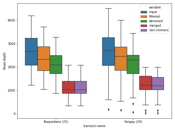
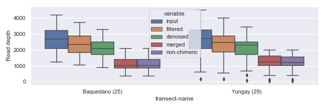
Here, we will see how to control various properties of a figure using the plotting method dokdo.denoising_stats_plot() as an example. This method creates a grouped box chart using denoising statistics from the DADA 2 algorithm.
qza_file = '/Users/sbslee/Desktop/dokdo/data/atacama-soil-microbiome-tutorial/denoising-stats.qza'
metadata_file = '/Users/sbslee/Desktop/dokdo/data/atacama-soil-microbiome-tutorial/sample-metadata.tsv'

dokdo.denoising_stats_plot(
    qza_file,
    metadata_file,
    'transect-name',
    figsize=(8, 6)
)

plt.tight_layout()
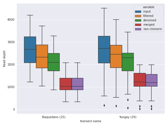
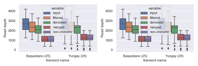
Aesthetics
The first thing we can do is changing the figure style. I personally like the seaborn package’s default style.
import seaborn as sns

with sns.axes_style('darkgrid'):
    dokdo.denoising_stats_plot(
        qza_file,
        metadata_file,
        'transect-name',
        figsize=(8, 6)
    )

plt.tight_layout()
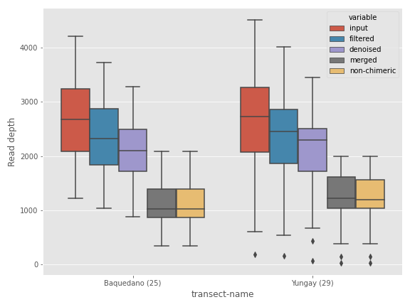
If you’re coming from the world of R software, you may find the ggplot style more soothing for your eyes.
with plt.style.context('ggplot'):
    dokdo.denoising_stats_plot(
        qza_file,
        metadata_file,
        'transect-name',
        figsize=(8, 6)
    )

plt.tight_layout()
Note that in both cases, the styling is set locally. If you plan to make many plots and want to set the style for all of them (i.e. globally), use the following.
sns.set()
# plt.style.use('ggplot')
Finally, you can turn off the styling at any point after setting it globally with the following.
# import matplotlib
# matplotlib.rc_file_defaults()
For the remaining examples, we will use the seaborn style.
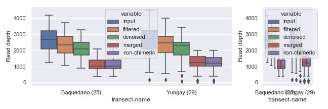
Plot Size
There are various ways you can control the figure size. The easiest way is to use the figsize argument in a plotting method call, as shown below.
dokdo.denoising_stats_plot(
    qza_file,
    metadata_file,
    'transect-name',
    figsize=(9, 3)
)

plt.tight_layout()
If you plan to draw more than one plot in the same figure (i.e. multiple “subplots”), you can specify size for the entire figure in the following way.
fig, [ax1, ax2] = plt.subplots(1, 2, figsize=(9, 3))

dokdo.denoising_stats_plot(
    qza_file,
    metadata_file,
    'transect-name',
    ax=ax1
)

dokdo.denoising_stats_plot(
    qza_file,
    metadata_file,
    'transect-name',
    ax=ax2
)

plt.tight_layout()
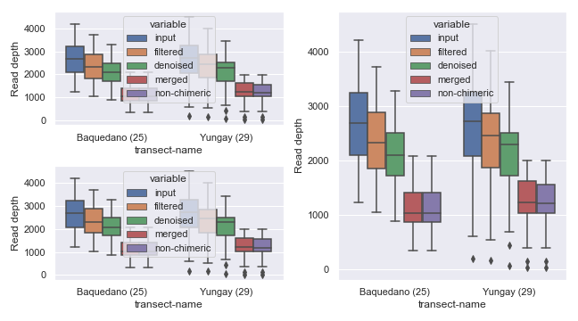
You can also set the width and/or height of individual subplots using width_ratios and height_ratios from gridspec_kw.
fig, [ax1, ax2] = plt.subplots(1, 2, figsize=(9, 3), gridspec_kw={'width_ratios': [8, 2]})

dokdo.denoising_stats_plot(
    qza_file,
    metadata_file,
    'transect-name',
    ax=ax1
)

dokdo.denoising_stats_plot(
    qza_file,
    metadata_file,
    'transect-name',
    ax=ax2
)

plt.tight_layout()
Alternatively, you can combine empty subplots to create a bigger subplot using gridspec.
import matplotlib.gridspec as gridspec

fig, axes  = plt.subplots(2, 2, figsize=(9, 5))

dokdo.denoising_stats_plot(
    qza_file,
    metadata_file,
    'transect-name',
    ax=axes[0][0]
)

dokdo.denoising_stats_plot(
    qza_file,
    metadata_file,
    'transect-name',
    ax=axes[1][0]
)

gs = axes[0, 1].get_gridspec()

for ax in axes[0:2, 1]:
    ax.remove()

axbig = fig.add_subplot(gs[0:2, 1])

dokdo.denoising_stats_plot(
    qza_file,
    metadata_file,
    'transect-name',
    ax=axbig
)

plt.tight_layout()
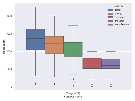
Sample Filtering
Sometimes, you may want to plot only a subset of the samples. This can be easily done by providing filtered metadata to the plotting method.
from qiime2 import Metadata

mf = dokdo.get_mf(metadata_file)
mf = mf[mf['transect-name'] == 'Yungay']

dokdo.denoising_stats_plot(
    qza_file,
    metadata=Metadata(mf),
    where='transect-name',
    figsize=(8, 6)
)

plt.tight_layout()
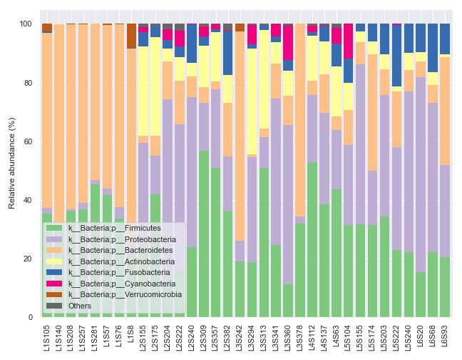
Plotting Legend Separately
In some situations, we may wish to plot the graph and the legend separately. For example, the dokdo.taxa_abundance_bar_plot() method by default displays the whole taxa name, which can be quite long and disrupting as shown below.
qzv_file = '/Users/sbslee/Desktop/dokdo/data/moving-pictures-tutorial/taxa-bar-plots.qzv'

dokdo.taxa_abundance_bar_plot(
    qzv_file,
    level=2,
    count=8,
    figsize=(9, 7)
)

plt.tight_layout()
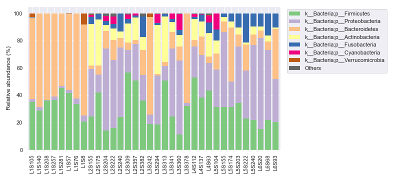
We can ameliorate the issue by plotting the legend separately.
fig, [ax1, ax2] = plt.subplots(1, 2, figsize=(11, 5), gridspec_kw={'width_ratios': [9, 1]})

dokdo.taxa_abundance_bar_plot(
    qzv_file,
    level=2,
    count=8,
    ax=ax1,
    legend=False
)

dokdo.taxa_abundance_bar_plot(
    qzv_file,
    level=2,
    count=8,
    ax=ax2
)

handles, labels = ax2.get_legend_handles_labels()

ax2.clear()
ax2.legend(handles, labels)
ax2.axis('off')

plt.tight_layout()
Plotting QIIME 2 Files vs. Objects
Thus far, for plotting purposes, we have only used files created by QIIME 2 CLI (i.e. .qza and .qzv files). However, we can also plot Python objects created by QIIME 2 API.
For example, we can directly plot the Artifact object from the qiime2.plugins.diversity.visualizers.alpha_rarefaction method (i.e. QIIME 2 API).
from qiime2 import Artifact, Metadata
from qiime2.plugins import diversity
table_file = '/Users/sbslee/Desktop/dokdo/data/moving-pictures-tutorial/table.qza'
phylogeny_file = '/Users/sbslee/Desktop/dokdo/data/moving-pictures-tutorial/rooted-tree.qza'
metadata_file = '/Users/sbslee/Desktop/dokdo/data/moving-pictures-tutorial/sample-metadata.tsv'
table = Artifact.load(table_file)
phylogeny = Artifact.load(phylogeny_file)
metadata = Metadata.load(metadata_file)
rarefaction_result = diversity.visualizers.alpha_rarefaction(
table=table,
metadata=metadata,
phylogeny=phylogeny,
max_depth=4000
)
rarefaction = rarefaction_result.visualization
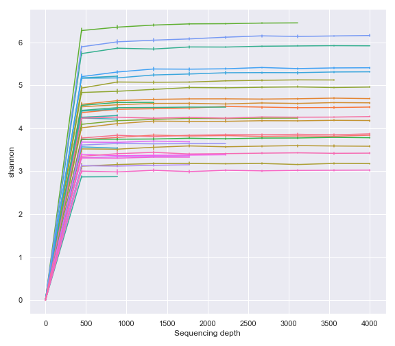
dokdo.alpha_rarefaction_plot(rarefaction, legend=False, figsize=(8, 7))
plt.tight_layout()
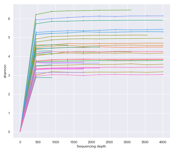
As expected, above gives the same result as using the Visualization file created by the qiime diversity alpha-rarefaction command (i.e. QIIME 2 CLI).
qzv_file = '/Users/sbslee/Desktop/dokdo/data/moving-pictures-tutorial/alpha-rarefaction.qzv'

dokdo.alpha_rarefaction_plot(qzv_file, legend=False, figsize=(8, 7))

plt.tight_layout()
General Methods
cross_association_table
- dokdo.api.cross_association.cross_association_table(artifact, target, method='spearman', normalize=None, alpha=0.05, multitest='fdr_bh', nsig=0)[source]
Compute cross-correlation between feature table and target matrices.
This method is essentially equivalent to the
associate()function from themicrobiomeR package.- Parameters
artifact (str, qiime2.Artifact, or pandas.DataFrame) – Feature table. This can be an QIIME 2 artifact file or object with the semantic type
FeatureTable[Frequency]. If you are importing data from an external tool, you can also provide apandas.DataFrameobject where rows indicate samples and columns indicate taxa.target (pandas.DataFrame) – Target
pandas.DataFrameobject to be used for cross-correlation analysis.method ({‘spearman’, ‘pearson’}, default: ‘spearman’) – Association method.
normalize ({None, ‘log10’, ‘clr’, ‘zscore’}, default: None) – Whether to normalize the feature table:
None: Do not normalize.
‘log10’: Apply the log10 transformation after adding a psuedocount of 1.
‘clr’: Apply the centre log ratio (CLR) transformation adding a psuedocount of 1.
‘zscore’: Apply the Z score transformation.
alpha (float, default: 0.05) – FWER, family-wise error rate.
multitest (str, default: ‘fdr_bh’) – Method used for testing and adjustment of p values, as defined in
statsmodels.stats.multitest.multipletests().nsig (int, default: 0) – Mininum number of significant correlations for each element.
- Returns
Cross-association table.
- Return type
pandas.DataFrame
See also
dokdo.api.cross_association.cross_association_heatmap,dokdo.api.cross_association.cross_association_regplotExamples
Below example is taken from a tutorial by Leo Lahti and Sudarshan Shetty et al.
import pandas as pd
import dokdo
otu = pd.read_csv('/Users/sbslee/Desktop/dokdo/data/miscellaneous/otu.csv', index_col=0)
lipids = pd.read_csv('/Users/sbslee/Desktop/dokdo/data/miscellaneous/lipids.csv', index_col=0)
df = dokdo.cross_association_table(
    otu, lipids, normalize='log10', nsig=1
)
df.head(10)
# Will print:
#                              taxon      target      corr          pval      adjp
# 0      Ruminococcus gnavus et rel.  TG(54:5).2  0.716496  4.516954e-08  0.002284
# 1         Uncultured Bacteroidetes  TG(56:2).1 -0.698738  1.330755e-07  0.002345
# 2                    Moraxellaceae   PC(40:3e) -0.694186  1.733720e-07  0.002345
# 3      Ruminococcus gnavus et rel.    TG(50:4)  0.691191  2.058030e-07  0.002345
# 4  Lactobacillus plantarum et rel.    PC(40:3) -0.687798  2.493210e-07  0.002345
# 5      Ruminococcus gnavus et rel.  TG(54:6).1  0.683580  3.153275e-07  0.002345
# 6      Ruminococcus gnavus et rel.  TG(54:4).2  0.682030  3.434292e-07  0.002345
# 7      Ruminococcus gnavus et rel.    TG(52:5)  0.680622  3.709485e-07  0.002345
# 8                     Helicobacter    PC(40:3) -0.673201  5.530595e-07  0.003108
# 9                    Moraxellaceae  PC(38:4).1 -0.670050  6.530463e-07  0.003302
get_mf
- dokdo.api.common.get_mf(metadata)[source]
Convert a Metadata file or object to a dataframe.
This method automatically detects the type of input metadata and then converts it to a
pandas.DataFrameobject.- Parameters
metadata (str or qiime2.Metadata) – Metadata file or object.
- Returns
DataFrame object containing metadata.
- Return type
pandas.DataFrame
Examples
This is a simple example.
mf = dokdo.get_mf('/Users/sbslee/Desktop/dokdo/data/moving-pictures-tutorial/sample-metadata.tsv')
mf.head()
# Will print:
#           barcode-sequence  body-site  ...  reported-antibiotic-usage  days-since-experiment-start
# sample-id                              ...
# L1S8          AGCTGACTAGTC        gut  ...                        Yes                          0.0
# L1S57         ACACACTATGGC        gut  ...                         No                         84.0
# L1S76         ACTACGTGTGGT        gut  ...                         No                        112.0
# L1S105        AGTGCGATGCGT        gut  ...                         No                        140.0
# L2S155        ACGATGCGACCA  left palm  ...                         No                         84.0
ordinate
- dokdo.api.ordinate.ordinate(table, metadata=None, metric='jaccard', sampling_depth=-1, phylogeny=None, number_of_dimensions=None, biplot=False)[source]
Perform ordination using principal coordinate analysis (PCoA).
This method wraps multiple QIIME 2 methods to perform ordination and returns Artifact object containing PCoA results.
Under the hood, this method filters the samples (if requested), performs rarefying of the feature table (if requested), computes distance matrix, and then runs PCoA.
By default, the method returns PCoAResults. For creating a biplot, use biplot=True which returns PCoAResults % Properties(‘biplot’).
- Parameters
table (str or qiime2.Artifact) – Artifact file or object corresponding to FeatureTable[Frequency].
metadata (str or qiime2.Metadata, optional) – Metadata file or object. All samples in ‘metadata’ that are also in the feature table will be retained.
metric (str, default: ‘jaccard’) – Metric used for distance matrix computation (‘jaccard’, ‘bray_curtis’, ‘unweighted_unifrac’, or ‘weighted_unifrac’).
sampling_depth (int, default: -1) – If negative, skip rarefying. If 0, rarefy to the sample with minimum depth. Otherwise, rarefy to the provided sampling depth.
phylogeny (str, optional) – Rooted tree file. Required if using ‘unweighted_unifrac’, or ‘weighted_unifrac’ as metric.
number_of_dimensions (int, optional) – Dimensions to reduce the distance matrix to.
biplot (bool, default: False) – If true, return PCoAResults % Properties(‘biplot’).
- Returns
Artifact object corresponding to PCoAResults or PCoAResults % Properties(‘biplot’).
- Return type
qiime2.Artifact
See also
dokdo.api.beta_2d_plot,dokdo.api.beta_3d_plot,dokdo.api.beta_scree_plot,dokdo.api.beta_parallel_plotNotes
The resulting Artifact object can be directly used for plotting.
Examples
Below is a simple example. Note that the default distance metric used is
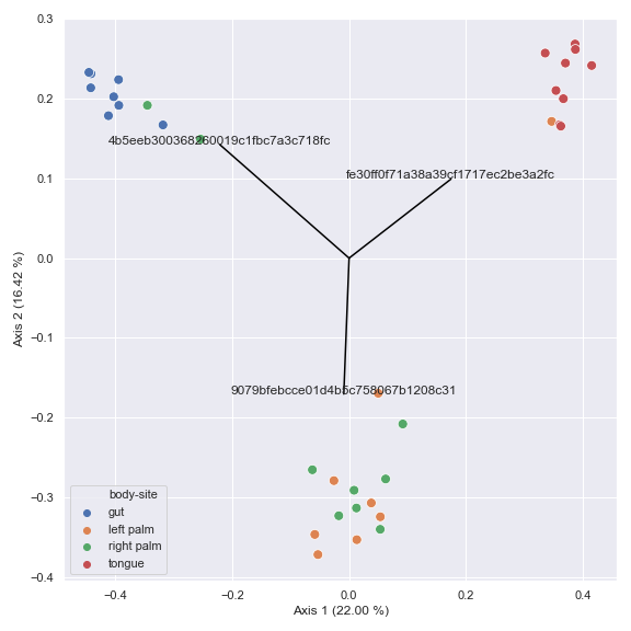
jaccard. The resulting objectpcoacan be directly used for plotting by thedokdo.beta_2d_plotmethod as shown below.import dokdo import matplotlib.pyplot as plt %matplotlib inline import seaborn as sns sns.set() qza_file = '/Users/sbslee/Desktop/dokdo/data/moving-pictures-tutorial/table.qza' metadata_file = '/Users/sbslee/Desktop/dokdo/data/moving-pictures-tutorial/sample-metadata.tsv' pcoa_results = dokdo.ordinate(qza_file) dokdo.beta_2d_plot( pcoa_results, metadata=metadata_file, hue='body-site', figsize=(8, 8) ) plt.tight_layout()
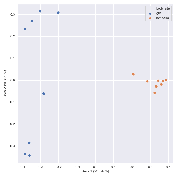
You can choose a subset of samples.
from qiime2 import Metadata

mf = dokdo.get_mf(metadata_file)
mf = mf[mf['body-site'].isin(['gut', 'left palm'])]

pcoa_results = dokdo.ordinate(qza_file, metadata=Metadata(mf))

dokdo.beta_2d_plot(
    pcoa_results,
    metadata=metadata_file,
    hue='body-site',
    figsize=(8, 8)
)

plt.tight_layout()
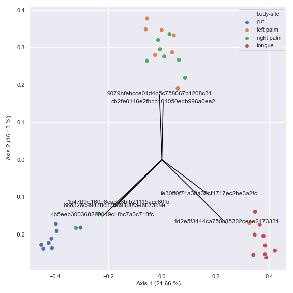
You can also generate a biplot.
pcoa_results = dokdo.ordinate(qza_file, biplot=True, number_of_dimensions=10)

ax = dokdo.beta_2d_plot(
    pcoa_results,
    metadata=metadata_file,
    hue='body-site',
    figsize=(8, 8)
)

dokdo.addbiplot(pcoa_results, ax=ax, count=7)

plt.tight_layout()
pname
- dokdo.api.common.pname(name, levels=None, delimiter=';')[source]
Return a prettified taxon name.
- Parameters
name (str) – Taxon name.
levels (list, optional) – Which taxonomic rank(s) to display. For example, assuming a taxon name is composed of seven taxonomic ranks (i.e. kingdom to species)
levels=[6, 7]will only return 6th (genus) and 7th (species) labels.delimiter (str, default: ‘;’) – Delimiter used to separate taxonomic ranks. If this delimiter is not found, the method will simply return the input taxon name as is (e.g. ASV ID).
- Returns
Prettified taxon name.
- Return type
str
Examples
import dokdo

dokdo.pname('d__Bacteria;p__Actinobacteriota;c__Actinobacteria;o__Actinomycetales;f__Actinomycetaceae;g__Actinomyces;s__Schaalia_radingae')
# Will print: 's__Schaalia_radingae'

dokdo.pname('Unassigned;__;__;__;__;__;__')
# Will print: 'Unassigned'

dokdo.pname('d__Bacteria;__;__;__;__;__;__')
# Will print: 'd__Bacteria'

dokdo.pname('d__Bacteria;p__Acidobacteriota;c__Acidobacteriae;o__Bryobacterales;f__Bryobacteraceae;g__Bryobacter;__')
# Will print: 'g__Bryobacter'

dokdo.pname('d__Bacteria;p__Actinobacteriota;c__Actinobacteria;o__Actinomycetales;f__Actinomycetaceae;g__Actinomyces;s__Schaalia_radingae', levels=[6, 7])
# Will print: 'g__Actinomyces;s__Schaalia_radingae'

dokdo.pname('1ad289cd8f44e109fd95de0382c5b252')
# Will print: '1ad289cd8f44e109fd95de0382c5b252'
num2sig
- dokdo.api.num2sig.num2sig(num)[source]
Convert a p-avalue to a signifiacne annotation.
Significance annotations are defined as follows:
P-value
Signifiacne
0.05 < P
ns
0.01 < P <= 0.05
*
0.001 < P <= 0.01
**
0.0001 < P <= 0.001
***
P <= 0.0001
****
- Parameters
num (float) – P-value to be converted.
- Returns
Signifiance annotation.
- Return type
str
Examples
import dokdo

dokdo.num2sig(0.06)
# Will print: ns

dokdo.num2sig(0.03)
# Will print: *

dokdo.num2sig(0.009)
# Will print: **

dokdo.num2sig(0.0005)
# Will print: ***

dokdo.num2sig(1E-9)
# Will print: ****
wilcoxon
- dokdo.api.wilcoxon.wilcoxon(taxon, csv_file, subject, category, group1, group2, ann=False)[source]
Compute the p-value from the Wilcoxon Signed-rank test.
This method tests the null hypothesis that two related paired samples come from the same distribution for a given taxon using the
scipy.stats.wilcoxon()method.Note that one of the inputs for this method is a .csv file from the
dokdo.taxa_abundance_box_plot()method which contains the relvant data (e.g. relative abundance).- Parameters
taxon (str) – Target taxon name.
csv_file (str) – Path to the .csv file.
subject (str) – Column name to indicate pair information.
category (str) – Column name to be tested.
group1 (str) – First group in the category column.
group2 (str) – Second group in the category column.
ann (bool, default: False) – If True, return a signifiacne annotation instead of a p-value. See dokdo.num2sig for how signifiacne levels are defined.
- Returns
P-value or signifiance annotatiom.
- Return type
float or str
Examples
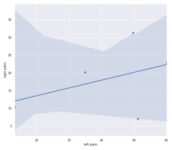
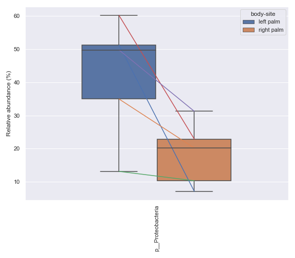
Below is a simple example where we pretend we only have the samples shown below and they are from a single subject. We are interested in comparing the relative abundance of the phylum Preteobacteria between the left palm and right palm. We also want to perofrm the comparison in the context of
days-since-experiment-start(i.e. paired comparison).import dokdo from qiime2 import Metadata import matplotlib.pyplot as plt %matplotlib inline import seaborn as sns sns.set() sample_names = ['L2S240', 'L3S242', 'L2S155', 'L4S63', 'L2S175', 'L3S313', 'L2S204', 'L4S112', 'L2S222', 'L4S137'] qzv_file = '/Users/sbslee/Desktop/dokdo/data/moving-pictures-tutorial/taxa-bar-plots.qzv' metadata_file = '/Users/sbslee/Desktop/dokdo/data/moving-pictures-tutorial/sample-metadata.tsv' metadata = Metadata.load(metadata_file) metadata = metadata.filter_ids(sample_names) mf = dokdo.get_mf(metadata) mf = mf[['body-site', 'days-since-experiment-start']] taxon = 'k__Bacteria;p__Proteobacteria' csv_file = 'wilcoxon.csv' ax = dokdo.taxa_abundance_box_plot( qzv_file, level=2, hue='body-site', taxa_names=[taxon], show_others=False, figsize=(6, 6), sample_names=sample_names, include_samples={'body-site': ['left palm', 'right palm']}, csv_file=csv_file, pretty_taxa=True ) dokdo.addpairs( taxon, csv_file, 'days-since-experiment-start', 'body-site', ['left palm', 'right palm'], ax=ax ) plt.tight_layout()
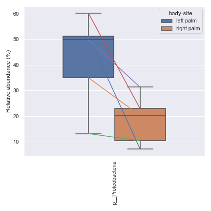
p_value = dokdo.wilcoxon(
    taxon,
    csv_file,
    'days-since-experiment-start',
    'body-site',
    'left palm',
    'right palm'
)
print(f'The p-value is {p_value:.6f}')
# Will print: The p-value is 0.062500
mannwhitneyu
- dokdo.api.mannwhitneyu.mannwhitneyu(taxon, csv_file, category, group1, group2, ann=False)[source]
Compute the p-value from the Mann–Whitney U test.
This method tests the null hypothesis that two independent samples come from the same distribution for a given taxon using the
scipy.stats.mannwhitneyu()method.Note that one of the inputs for this method is a .csv file from the
dokdo.taxa_abundance_box_plot()method which contains the relvant data (e.g. relative abundance).- Parameters
taxon (str) – Target taxon name.
csv_file (str) – Path to the .csv file.
category (str) – Column name to be tested.
group1 (str) – First group in the category column.
group2 (str) – Second group in the category column.
ann (bool, default: False) – If True, return a signifiacne annotation instead of a p-value. See dokdo.num2sig for how signifiacne levels are defined.
- Returns
P-value or signifiance annotation.
- Return type
float or str
Examples
Below is a sample example where we compare the relative abundance of the phylum Proteobacteria between the left palm and right palm. Before we can calculate the p-value for this comparison, we first need to create a .csv file containing the relevant data using the
dokdo.taxa_abundance_box_plotmethod.import dokdo from qiime2 import Metadata import matplotlib.pyplot as plt %matplotlib inline import seaborn as sns sns.set() from qiime2 import Metadata taxon = 'k__Bacteria;p__Proteobacteria' csv_file = 'mannwhitneyu.csv' qzv_file = '/Users/sbslee/Desktop/dokdo/data/moving-pictures-tutorial/taxa-bar-plots.qzv' ax = dokdo.taxa_abundance_box_plot( qzv_file, level=2, hue='body-site', taxa_names=[taxon], show_others=False, figsize=(8, 7), pretty_taxa=True, include_samples={'body-site': ['left palm', 'right palm']}, csv_file=csv_file ) plt.tight_layout()
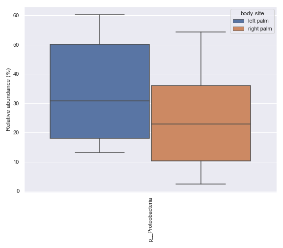
p_value = dokdo.mannwhitneyu(
    taxon,
    csv_file,
    'body-site',
    'left palm',
    'right palm'
)
print(f'The p-value is {p_value:.6f}')
# Will print: The p-value is 0.235243
Main Plotting Methods
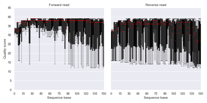
read_quality_plot
- dokdo.api.read_quality_plot.read_quality_plot(visualization, strand='forward', ax=None, figsize=None)[source]
Create a read quality plot.
q2-demux plugin
Example
QIIME 2 CLI
qiime demux summarize [OPTIONS]
QIIME 2 API
from qiime2.plugins.demux.visualizers import summarize
- Parameters
visualization (str or qiime2.Visualization) – Visualization file or object from the q2-demux plugin.
strand ({‘forward’, ‘reverse’}, default: ‘forward’) – Read strand to be displayed.
ax (matplotlib.axes.Axes, optional) – Axes object to draw the plot onto, otherwise uses the current Axes.
figsize (tuple, optional) – Width, height in inches. Format: (float, float).
- Returns
Axes object with the plot drawn onto it.
- Return type
matplotlib.axes.Axes
Examples
Below is a simple example:
import dokdo
import matplotlib.pyplot as plt
%matplotlib inline
import seaborn as sns
sns.set()
fig, [ax1, ax2] = plt.subplots(1, 2, figsize=(10, 5))
qzv_file = '/Users/sbslee/Desktop/dokdo/data/atacama-soil-microbiome-tutorial/demux-subsample.qzv'
dokdo.read_quality_plot(qzv_file, strand='forward', ax=ax1)
dokdo.read_quality_plot(qzv_file, strand='reverse', ax=ax2)
ax1.set_title('Forward read')
ax2.set_title('Reverse read')
ax2.set_ylabel('')
ax2.set_yticklabels([])
ax2.autoscale(enable=True, axis='x', tight=False)
plt.tight_layout()
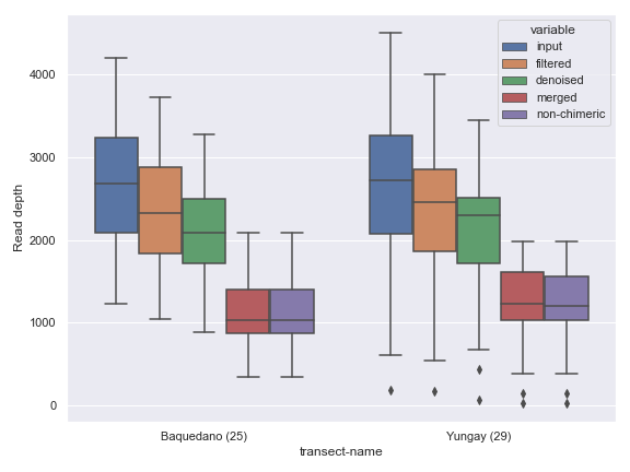
denoising_stats_plot
- dokdo.api.denoising_stats_plot.denoising_stats_plot(artifact, metadata, where, pseudocount=False, order=None, hide_nsizes=False, ax=None, figsize=None)[source]
Create a grouped box plot for denoising statistics from DADA2.
q2-dada2 plugin
Example
QIIME 2 CLI
qiime dada2 denoise-paired [OPTIONS]
QIIME 2 API
from qiime2.plugins.dada2.methods import denoise_paired
- Parameters
artifact (str or qiime2.Artifact) – Artifact file or object from the q2-dada2 plugin.
metadata (str or qiime2.Metadata) – Metadata file or object.
where (str) – Column name of the sample metadata.
pseudocount (bool, default: False) – Add pseudocount to remove zeros.
order (list, optional) – Order to plot the categorical levels in.
hide_nsizes (bool, default: False) – Hide sample size from x-axis labels.
ax (matplotlib.axes.Axes, optional) – Axes object to draw the plot onto, otherwise uses the current Axes.
figsize (tuple, optional) – Width, height in inches. Format: (float, float).
- Returns
Axes object with the plot drawn onto it.
- Return type
matplotlib.axes.Axes
Examples
Below is a simple example.
import dokdo
import matplotlib.pyplot as plt
%matplotlib inline
import seaborn as sns
sns.set()
qza_file = '/Users/sbslee/Desktop/dokdo/data/atacama-soil-microbiome-tutorial/denoising-stats.qza'
metadata_file = '/Users/sbslee/Desktop/dokdo/data/atacama-soil-microbiome-tutorial/sample-metadata.tsv'
dokdo.denoising_stats_plot(qza_file,
                           metadata_file,
                           'transect-name',
                           figsize=(8, 6))
plt.tight_layout()
alpha_rarefaction_plot
- dokdo.api.alpha_rarefaction_plot.alpha_rarefaction_plot(visualization, hue='sample-id', metric='shannon', hue_order=None, units=None, estimator='mean', legend='brief', ax=None, figsize=None)[source]
Create an alpha rarefaction plot.
q2-diversity plugin
Example
QIIME 2 CLI
qiime diversity alpha-rarefaction [OPTIONS]
QIIME 2 API
from qiime2.plugins.diversity.visualizers import alpha_rarefaction
- Parameters
visualization (str or qiime2.Visualization) – Visualization file or object from the q2-diversity plugin.
hue (str, default: ‘sample-id’) – Grouping variable that will produce lines with different colors. If not provided, sample IDs will be used.
metric (str, default: ‘shannon’) – Diversity metric (‘shannon’, ‘observed_features’, or ‘faith_pd’).
hue_order (list, optional) – Specify the order of categorical levels of the ‘hue’ semantic.
units (str, optional) – Grouping variable identifying sampling units. When used, a separate line will be drawn for each unit with appropriate semantics, but no legend entry will be added.
estimator (str, default: ‘mean’, optional) – Method for aggregating across multiple observations of the y variable at the same x level. If None, all observations will be drawn.
legend (str, default: ‘brief’) – Legend type as in
seaborn.lineplot().ax (matplotlib.axes.Axes, optional) – Axes object to draw the plot onto, otherwise uses the current Axes.
figsize (tuple, optional) – Width, height in inches. Format: (float, float).
- Returns
Axes object with the plot drawn onto it.
- Return type
matplotlib.axes.Axes
Examples
Below is a simple example:
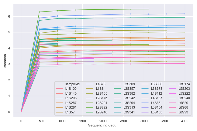
import dokdo
import matplotlib.pyplot as plt
%matplotlib inline
import seaborn as sns
sns.set()
qzv_file = '/Users/sbslee/Desktop/dokdo/data/moving-pictures-tutorial/alpha-rarefaction.qzv'
ax = dokdo.alpha_rarefaction_plot(qzv_file,
                                  figsize=(9, 6))
ax.legend(ncol=5)
plt.tight_layout()
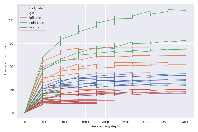
We can group the samples by body-site:
dokdo.alpha_rarefaction_plot(qzv_file,
                             hue='body-site',
                             metric='observed_features',
                             figsize=(9, 6),
                             units='sample-id',
                             estimator=None)
plt.tight_layout()
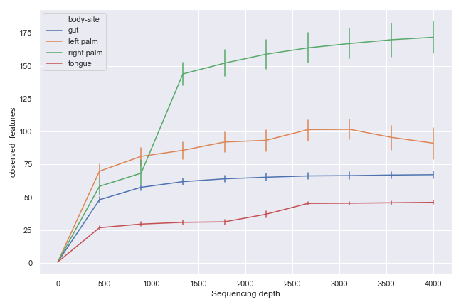
Alternatively, we can aggregate the samples by body-site:
dokdo.alpha_rarefaction_plot(qzv_file,
                             hue='body-site',
                             metric='observed_features',
                             figsize=(9, 6))
plt.tight_layout()
alpha_diversity_plot
- dokdo.api.alpha_diversity_plot.alpha_diversity_plot(artifact, metadata, where, add_swarmplot=False, order=None, hide_nsizes=False, ax=None, figsize=None)[source]
Create an alpha diversity plot.
q2-diversity plugin
Example
QIIME 2 CLI
qiime diversity core-metrics-phylogenetic [OPTIONS]
QIIME 2 API
from qiime2.plugins.diversity.pipelines import core_metrics_phylogenetic
- Parameters
artifact (str, qiime2.Artifact, or pandas.DataFrame) – Artifact file or object from the q2-diversity plugin with the semantic type
SampleData[AlphaDiversity]. If you are importing data from a software tool other than QIIME 2, then you can provide apandas.DataFrameobject in which the row index is sample names and the only column is diversity values with its header being the name of metrics used (e.g. ‘faith_pd’).metadata (str or qiime2.Metadata) – Metadata file or object.
where (str) – Column name to be used for the x-axis.
add_swarmplot (bool, default: False) – Add a swarm plot on top of the box plot.
order (list, optional) – Order to plot the categorical levels in.
hide_nsizes (bool, default: False) – Hide sample size from x-axis labels.
ax (matplotlib.axes.Axes, optional) – Axes object to draw the plot onto, otherwise uses the current Axes.
figsize (tuple, optional) – Width, height in inches. Format: (float, float).
- Returns
Axes object with the plot drawn onto it.
- Return type
matplotlib.axes.Axes
Examples
Below is a simple example.
import dokdo
import matplotlib.pyplot as plt
%matplotlib inline
import seaborn as sns
sns.set()
qza_file = '/Users/sbslee/Desktop/dokdo/data/moving-pictures-tutorial/faith_pd_vector.qza'
metadata_file = '/Users/sbslee/Desktop/dokdo/data/moving-pictures-tutorial/sample-metadata.tsv'
dokdo.alpha_diversity_plot(qza_file, metadata_file, 'body-site')
plt.tight_layout()
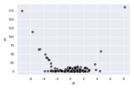
beta_2d_plot
- dokdo.api.beta_2d_plot.beta_2d_plot(artifact, metadata=None, hue=None, size=None, style=None, s=80, alpha=None, hue_order=None, style_order=None, legend='brief', ax=None, figsize=None, palette=None, **kwargs)[source]
Create a 2D scatter plot from PCoA results.
In addition to creating a PCoA plot, this method prints out the proportions explained by each axis.
q2-diversity plugin
Example
QIIME 2 CLI
qiime diversity pcoa [OPTIONS]
QIIME 2 API
from qiime2.plugins.diversity.methods import pcoa
- Parameters
artifact (str, qiime2.Artifact, or pandas.DataFrame) – Artifact file or object from the q2-diversity plugin with the semantic type
PCoAResultsorPCoAResults % Properties('biplot'). If you are importing data from a software tool other than QIIME 2, then you can provide apandas.DataFrameobject in which the row index is sample names and the first and second columns indicate the first and second PCoA axes, respectively.metadata (str or qiime2.Metadata, optional) – Metadata file or object.
hue (str, optional) – Grouping variable that will produce points with different colors.
size (str, optional) – Grouping variable that will produce points with different sizes.
style (str, optional) – Grouping variable that will produce points with different markers.
s (float, default: 80.0) – Marker size.
alpha (float, optional) – Proportional opacity of the points.
hue_order (list, optional) – Specify the order of categorical levels of the ‘hue’ semantic.
style_order (list, optional) – Specify the order of categorical levels of the ‘style’ semantic.
legend (str, default: ‘brief’) – Legend type as in
seaborn.scatterplot().ax (matplotlib.axes.Axes, optional) – Axes object to draw the plot onto, otherwise uses the current Axes.
figsize (tuple, optional) – Width, height in inches. Format: (float, float).
palette (string, list, dict, or matplotlib.colors.Colormap) – Method for choosing the colors to use when mapping the
huesemantic. List or dict values imply categorical mapping, while a colormap object implies numeric mapping.kwargs (other keyword arguments) – Other keyword arguments will be passed down to
seaborn.scatterplot().
- Returns
Axes object with the plot drawn onto it.
- Return type
matplotlib.axes.Axes
See also
dokdo.api.ordinate,dokdo.api.beta_3d_plot,dokdo.api.beta_scree_plot,dokdo.api.beta_parallel_plot,dokdo.api.addbiplotExamples
Below is a simple example.
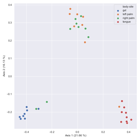
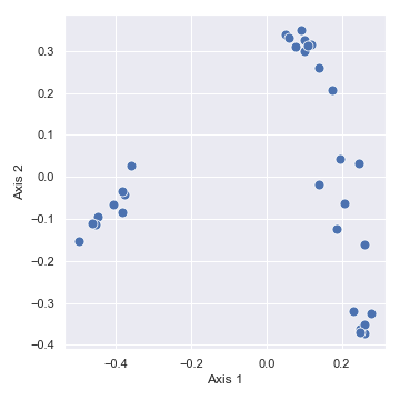
import dokdo
import matplotlib.pyplot as plt
%matplotlib inline
import seaborn as sns
sns.set()
qza_file = '/Users/sbslee/Desktop/dokdo/data/moving-pictures-tutorial/unweighted_unifrac_pcoa_results.qza'
metadata_file = '/Users/sbslee/Desktop/dokdo/data/moving-pictures-tutorial/sample-metadata.tsv'
dokdo.beta_2d_plot(qza_file,
                   figsize=(5, 5))
plt.tight_layout()
# Explained proportions computed by QIIME 2:
# 33.94% for Axis 1
# 25.90% for Axis 2
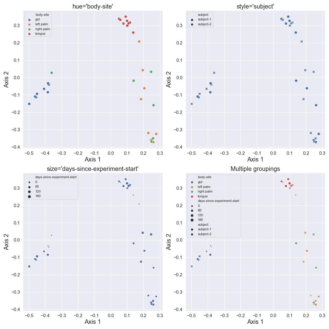
We can color the datapoints with
hue. We can also change the style of datapoints withstyle. If the variable of interest is numeric, we can usesizeto control the size of datapoints. Finally, we can combine all those groupings.fig, [[ax1, ax2], [ax3, ax4]] = plt.subplots(2, 2, figsize=(15, 15)) dokdo.beta_2d_plot(qza_file, metadata_file, ax=ax1, hue='body-site') dokdo.beta_2d_plot(qza_file, metadata_file, ax=ax2, style='subject') dokdo.beta_2d_plot(qza_file, metadata_file, ax=ax3, size='days-since-experiment-start') dokdo.beta_2d_plot(qza_file, metadata_file, ax=ax4, hue='body-site', style='subject', size='days-since-experiment-start') ax1.set_title("hue='body-site'", fontsize=20) ax2.set_title("style='subject'", fontsize=20) ax3.set_title("size='days-since-experiment-start'", fontsize=20) ax4.set_title('Multiple groupings', fontsize=20) for ax in [ax1, ax2, ax3, ax4]: ax.xaxis.label.set_size(20) ax.yaxis.label.set_size(20) ax.tick_params(axis='both', which='major', labelsize=15) ax.legend(loc='upper left') plt.tight_layout()
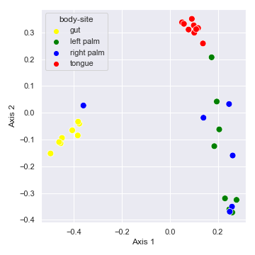
We can control categorical mapping of the
huevariable withpalette:palette = {'gut': 'yellow', 'left palm': 'green', 'right palm': 'blue', 'tongue': 'red'} dokdo.beta_2d_plot(qza_file, metadata_file, hue='body-site', palette=palette) plt.tight_layout()
beta_3d_plot
- dokdo.api.beta_3d_plot.beta_3d_plot(artifact, metadata=None, hue=None, azim=-60, elev=30, s=80, ax=None, figsize=None, hue_order=None, palette=None)[source]
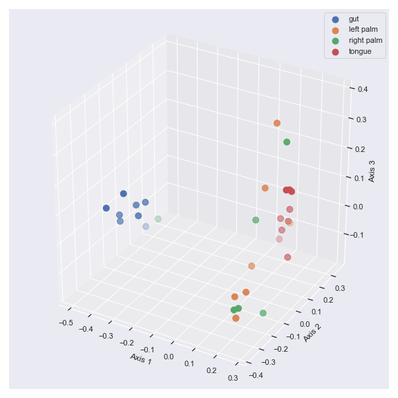
Create a 3D scatter plot from PCoA results.
In addition to creating a PCoA plot, this method prints out the proportions explained by each axis.
q2-diversity plugin
Example
QIIME 2 CLI
qiime diversity pcoa [OPTIONS]
QIIME 2 API
from qiime2.plugins.diversity.methods import pcoa
- Parameters
artifact (str or qiime2.Artifact) – Artifact file or object from the q2-diversity plugin with the semantic type
PCoAResultsorPCoAResults % Properties('biplot'). If you are importing data from a software tool other than QIIME 2, then you can provide apandas.DataFrameobject in which the row index is sample names and the first, second, and third columns indicate the first, second, and third PCoA axes, respectively.metadata (str or qiime2.Metadata, optional) – Metadata file or object.
hue (str, optional) – Grouping variable that will produce points with different colors.
azim (int, default: -60) – Azimuthal viewing angle.
elev (int, default: 30) – Elevation viewing angle.
s (float, default: 80.0) – Marker size.
ax (matplotlib.axes.Axes, optional) – Axes object to draw the plot onto, otherwise uses the current Axes.
figsize (tuple, optional) – Width, height in inches. Format: (float, float).
hue_order (list, optional) – Specify the order of categorical levels of the ‘hue’ semantic.
palette (dict) – Dictionary for choosing the colors to use when mapping the
huesemantic.
- Returns
Axes object with the plot drawn onto it.
- Return type
matplotlib.axes.Axes
See also
dokdo.api.ordinate,dokdo.api.beta_2d_plot,dokdo.api.beta_scree_plot,dokdo.api.beta_parallel_plot,dokdo.api.addbiplotExamples
Below is a simple example:
import dokdo
import matplotlib.pyplot as plt
%matplotlib inline
import seaborn as sns
sns.set()
qza_file = '/Users/sbslee/Desktop/dokdo/data/moving-pictures-tutorial/unweighted_unifrac_pcoa_results.qza'
metadata_file = '/Users/sbslee/Desktop/dokdo/data/moving-pictures-tutorial/sample-metadata.tsv'
dokdo.beta_3d_plot(qza_file,
                   metadata=metadata_file,
                   hue='body-site',
                   figsize=(8, 8))
plt.tight_layout()
# Explained proportions computed by QIIME 2:
# 33.94% for Axis 1
# 25.90% for Axis 2
# 6.63% for Axis 3
We can control the camera angle with
elevandazim:fig = plt.figure(figsize=(14, 7)) ax1 = fig.add_subplot(1, 2, 1, projection='3d') ax2 = fig.add_subplot(1, 2, 2, projection='3d') dokdo.beta_3d_plot(qza_file, metadata=metadata_file, ax=ax1, hue='body-site', elev=15) dokdo.beta_3d_plot(qza_file, metadata=metadata_file, ax=ax2, hue='body-site', azim=70) plt.tight_layout()
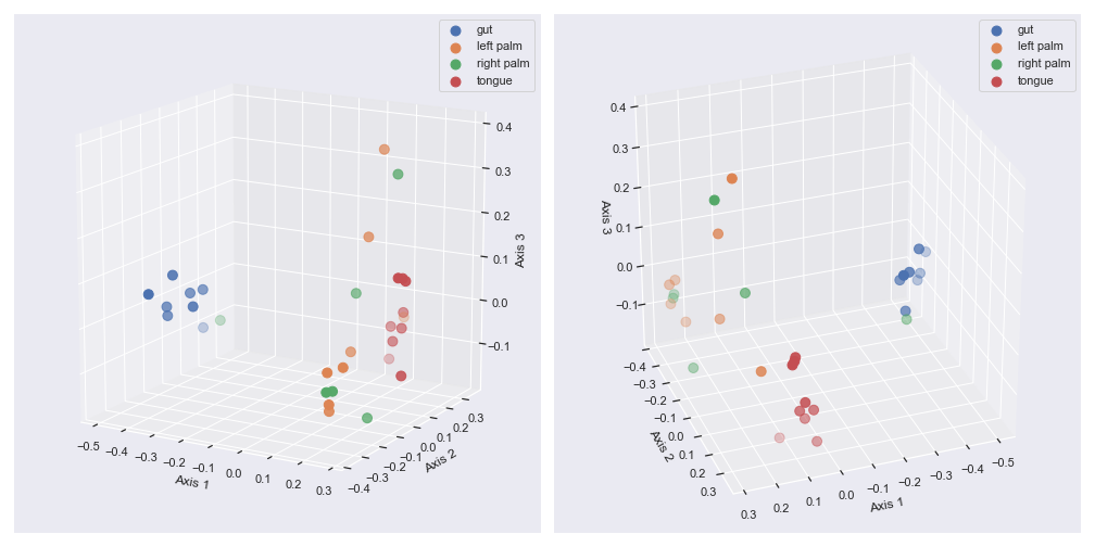
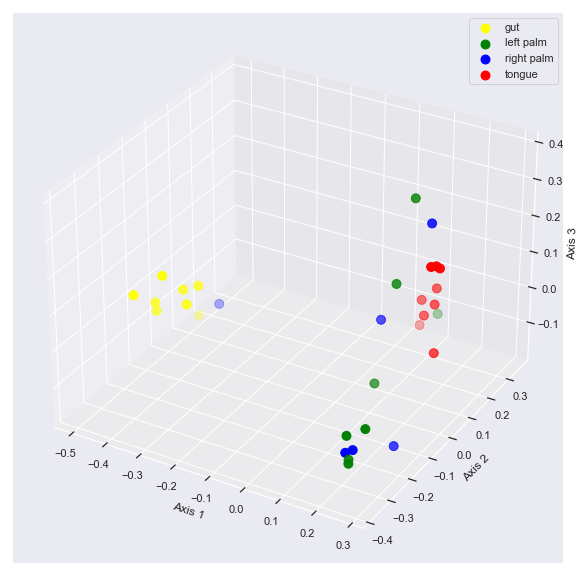
We can control categorical mapping of the
huevariable withpalette:palette = {'gut': 'yellow', 'left palm': 'green', 'right palm': 'blue', 'tongue': 'red'} dokdo.beta_3d_plot(qza_file, metadata=metadata_file, hue='body-site', palette=palette, figsize=(8, 8)) plt.tight_layout()
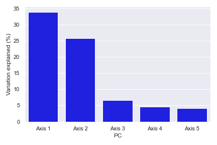
beta_scree_plot
- dokdo.api.beta_scree_plot.beta_scree_plot(artifact, count=5, color='blue', ax=None, figsize=None)[source]
Create a scree plot from PCoA results.
q2-diversity plugin
Example
QIIME 2 CLI
qiime diversity pcoa [OPTIONS]
QIIME 2 API
from qiime2.plugins.diversity.methods import pcoa
- Parameters
artifact (str or qiime2.Artifact) – Artifact file or object from the q2-diversity plugin with the semantic type
PCoAResultsorPCoAResults % Properties('biplot').count (int, default: 5) – Number of principal components to be displayed.
color (str, default: ‘blue’) – Bar color.
ax (matplotlib.axes.Axes, optional) – Axes object to draw the plot onto, otherwise uses the current Axes.
figsize (tuple, optional) – Width, height in inches. Format: (float, float).
- Returns
Axes object with the plot drawn onto it.
- Return type
matplotlib.axes.Axes
See also
dokdo.api.ordinate,dokdo.api.beta_2d_plot,dokdo.api.beta_3d_plot,dokdo.api.beta_parallel_plotExamples
Below is a simple example:
import dokdo
import matplotlib.pyplot as plt
%matplotlib inline
import seaborn as sns
sns.set()
qza_file = '/Users/sbslee/Desktop/dokdo/data/moving-pictures-tutorial/unweighted_unifrac_pcoa_results.qza'
dokdo.beta_scree_plot(qza_file)
plt.tight_layout()
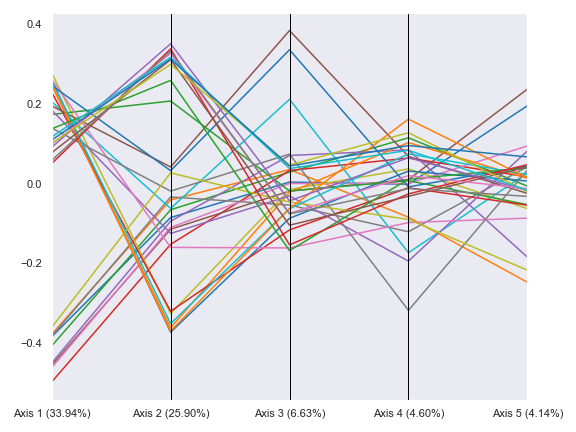
beta_parallel_plot
- dokdo.api.beta_parallel_plot.beta_parallel_plot(artifact, hue=None, hue_order=None, metadata=None, count=5, ax=None, figsize=None)[source]
Create a parallel plot from PCoA results.
q2-diversity plugin
Example
QIIME 2 CLI
qiime diversity pcoa [OPTIONS]
QIIME 2 API
from qiime2.plugins.diversity.methods import pcoa
- Parameters
artifact (str or qiime2.Artifact) – Artifact file or object from the q2-diversity plugin with the semantic type
PCoAResultsorPCoAResults % Properties('biplot').hue (str, optional) – Grouping variable that will produce lines with different colors.
hue_order (list, optional) – Specify the order of categorical levels of the ‘hue’ semantic.
metadata (str or qiime2.Metadata, optional) – Metadata file or object. Required if ‘hue’ is used.
count (int, default: 5) – Number of principal components to be displayed.
ax (matplotlib.axes.Axes, optional) – Axes object to draw the plot onto, otherwise uses the current Axes.
figsize (tuple, optional) – Width, height in inches. Format: (float, float).
- Returns
Axes object with the plot drawn onto it.
- Return type
matplotlib.axes.Axes
See also
dokdo.api.ordinate,dokdo.api.beta_2d_plot,dokdo.api.beta_3d_plot,dokdo.api.beta_scree_plotExamples
Below is a simple example:
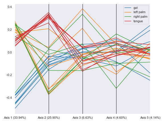
import dokdo
import matplotlib.pyplot as plt
%matplotlib inline
import seaborn as sns
sns.set()
qza_file = '/Users/sbslee/Desktop/dokdo/data/moving-pictures-tutorial/unweighted_unifrac_pcoa_results.qza'
metadata_file = '/Users/sbslee/Desktop/dokdo/data/moving-pictures-tutorial/sample-metadata.tsv'
dokdo.beta_parallel_plot(qza_file,
                         figsize=(8, 6))
plt.tight_layout()
We can group the lines by body-site:
dokdo.beta_parallel_plot(qza_file,
                         metadata=metadata_file,
                         hue='body-site',
                         figsize=(8, 6))
plt.tight_layout()
distance_matrix_plot
- dokdo.api.distance_matrix_plot.distance_matrix_plot(distance_matrix, bins=100, pairs=None, density=False, ax=None, figsize=None)[source]
Create a histogram from a distance matrix.
- Parameters
distance_matrix (str or qiime2.Artifact) – Artifact file or object with the semantic type DistanceMatrix.
bins (int, optional) – Number of bins to be displayed.
pairs (list, optional) – List of sample pairs to be shown in red vertical lines.
density (bool, default: False) – If True, draw and return a probability density.
ax (matplotlib.axes.Axes, optional) – Axes object to draw the plot onto, otherwise uses the current Axes.
figsize (tuple, optional) – Width, height in inches. Format: (float, float).
- Returns
Axes object with the plot drawn onto it.
- Return type
matplotlib.axes.Axes
Examples
Below is a simple example:
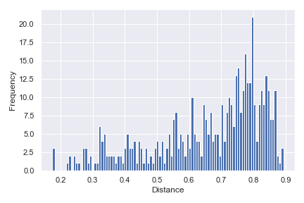
import dokdo
import matplotlib.pyplot as plt
%matplotlib inline
import seaborn as sns
sns.set()
qza_file = '/Users/sbslee/Desktop/dokdo/data/moving-pictures-tutorial/unweighted_unifrac_distance_matrix.qza'
dokdo.distance_matrix_plot(qza_file)
plt.tight_layout()
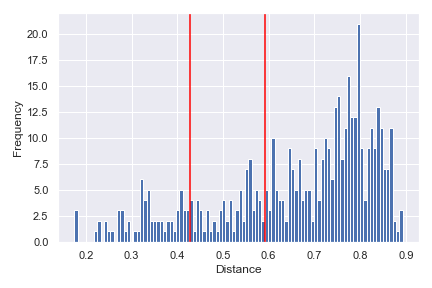
We can indicate the distance between any two samples on top of the histogram using
pairs:dokdo.distance_matrix_plot(qza_file, pairs=[['L1S8', 'L1S57'], ['L2S175', 'L2S204']]) plt.tight_layout()
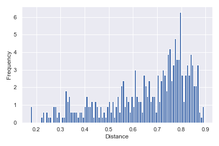
Finally, we can show a density histogram:
dokdo.distance_matrix_plot(qza_file, density=True)
plt.tight_layout()
taxa_abundance_bar_plot
- dokdo.api.taxa_abundance.taxa_abundance_bar_plot(visualization, metadata=None, level=1, group=None, group_order=None, by=None, ax=None, figsize=None, width=0.8, count=0, exclude_samples=None, include_samples=None, exclude_taxa=None, sort_by_names=False, colors=None, label_columns=None, orders=None, sample_names=None, csv_file=None, taxa_names=None, sort_by_mean1=True, sort_by_mean2=True, sort_by_mean3=True, show_others=True, cmap_name='Accent', legend_short=False, pname_kws=None, legend=True)[source]
Create a bar plot showing relative taxa abundance for individual samples.
The input visualization may already contain sample metadata. To provide new sample metadata, and ignore the existing one, use the
metadataoption.By default, the method will draw a bar for each sample. To plot the average taxa abundance of each sample group, use the
groupoption.Warning
You may get unexpected results when using
groupif samples have uneven sequencing depth. For example, an outlier sample with an extraordinarily large depth could easily mask the contributions from the rest of the samples. Therefore, it’s strongly recommended to rarefy the input feature table when plotting withgroup.q2-taxa plugin
Example
QIIME 2 CLI
qiime taxa barplot [OPTIONS]
QIIME 2 API
from qiime2.plugins.taxa.visualizers import barplot
- Parameters
visualization (str, qiime2.Visualization, or pandas.DataFrame) – Visualization file or object from the q2-taxa plugin. Alternatively, a
pandas.DataFrameobject.metadata (str or qiime2.Metadata, optional) – Metadata file or object.
level (int, default: 1) – Taxonomic level at which the features should be collapsed.
group (str, optional) – Metadata column to be used for grouping the samples.
group_order (list, optional) – Order to plot the groups in.
by (list, optional) – Column name(s) to be used for sorting the samples. Using ‘sample-id’ will sort the samples by their name, in addition to other column name(s) that may have been provided. If multiple items are provided, sorting will occur by the order of the items.
ax (matplotlib.axes.Axes, optional) – Axes object to draw the plot onto, otherwise uses the current Axes.
figsize (tuple, optional) – Width, height in inches. Format: (float, float).
width (float, default: 0.8) – The width of the bars.
count (int, default: 0) – The number of taxa to display. When 0, display all.
exclude_samples (dict, optional) – Filtering logic used for sample exclusion. Format: {‘col’: [‘item’, …], …}.
include_samples (dict, optional) – Filtering logic used for sample inclusion. Format: {‘col’: [‘item’, …], …}.
exclude_taxa (list, optional) – The taxa names to be excluded when matched. Case insenstivie.
sort_by_names (bool, default: False) – If true, sort the columns (i.e. species) to be displayed by name.
colors (list, optional) – The bar colors.
label_columns (list, optional) – List of metadata columns to be concatenated to form new sample labels. Use the string ‘sample-id’ to indicate the sample ID column.
orders (dict, optional) – Dictionary of {column1: [element1, element2, …], column2: [element1, element2…], …} to indicate the order of items. Used to sort the sampels by the user-specified order instead of ordering numerically or alphabetically.
sample_names (list, optional) – List of sample IDs to be included.
csv_file (str, optional) – Path of the .csv file to output the dataframe to.
taxa_names (list, optional) – List of taxa names to be displayed.
sort_by_mean1 (bool, default: True) – Sort taxa by their mean relative abundance before sample filtration.
sort_by_mean2 (bool, default: True) – Sort taxa by their mean relative abundance after sample filtration by ‘include_samples’ or ‘exclude_samples’.
sort_by_mean3 (bool, default: True) – Sort taxa by their mean relative abundance after sample filtration by ‘sample_names’.
show_others (bool, default: True) – Include the ‘Others’ category.
cmap_name (str, default: ‘Accent’) – Name of the colormap passed to matplotlib.cm.get_cmap().
legend_short (bool, default: False) – If true, only display the smallest taxa rank in the legend.
pname_kws (dict, optional) – Keyword arguments for
dokdo.api.pname()whenlegend_shortis True.legend (bool, default: True) – Whether to plot the legend.
- Returns
Axes object with the plot drawn onto it.
- Return type
matplotlib.axes.Axes
See also
dokdo.api.taxa_abundance_box_plotExamples
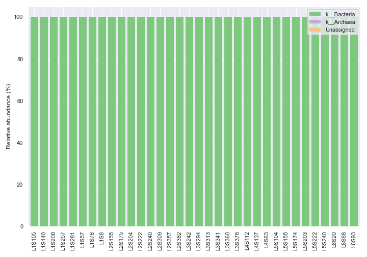
Below is a simple example showing taxonomic abundance at the kingdom level (i.e.
level=1), which is the default taxonomic rank.import dokdo import matplotlib.pyplot as plt %matplotlib inline import seaborn as sns sns.set() qzv_file = '/Users/sbslee/Desktop/dokdo/data/moving-pictures-tutorial/taxa-bar-plots.qzv' dokdo.taxa_abundance_bar_plot( qzv_file, figsize=(10, 7) ) plt.tight_layout()
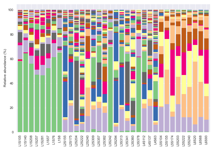
We can change the taxonomic rank from kingdom to genus by setting
level=6. Note that we are usinglegend=Falsebecause otherwise there will be too many taxa to display on the legend. Note also that the colors are recycled in each bar.dokdo.taxa_abundance_bar_plot( qzv_file, figsize=(10, 7), level=6, legend=False ) plt.tight_layout()
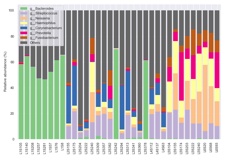
We can only show the top seven most abundant genera plus ‘Others’ with
count=8.dokdo.taxa_abundance_bar_plot( qzv_file, figsize=(10, 7), level=6, count=8, legend_short=True ) plt.tight_layout()
We can plot the figure and the legend separately.
fig, [ax1, ax2] = plt.subplots(1, 2, figsize=(10, 7), gridspec_kw={'width_ratios': [9, 1]})

dokdo.taxa_abundance_bar_plot(
    qzv_file,
    ax=ax1,
    level=6,
    count=8,
    legend=False
)

dokdo.taxa_abundance_bar_plot(
    qzv_file,
    ax=ax2,
    level=6,
    count=8,
    legend_short=True
)

handles, labels = ax2.get_legend_handles_labels()

ax2.clear()
ax2.legend(handles, labels)
ax2.axis('off')

plt.tight_layout()
We can use a different color map to display more unique genera (e.g. 20).
fig, [ax1, ax2] = plt.subplots(1, 2, figsize=(10, 7), gridspec_kw={'width_ratios': [9, 1]})

dokdo.taxa_abundance_bar_plot(
    qzv_file,
    ax=ax1,
    level=6,
    count=20,
    cmap_name='tab20',
    legend=False
)

dokdo.taxa_abundance_bar_plot(
    qzv_file,
    ax=ax2,
    level=6,
    count=20,
    cmap_name='tab20',
    legend_short=True
)

handles, labels = ax2.get_legend_handles_labels()

ax2.clear()
ax2.legend(handles, labels)
ax2.axis('off')

plt.tight_layout()
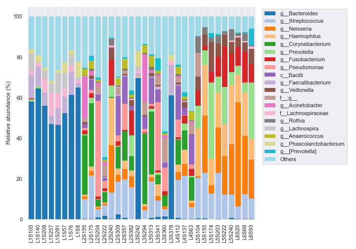
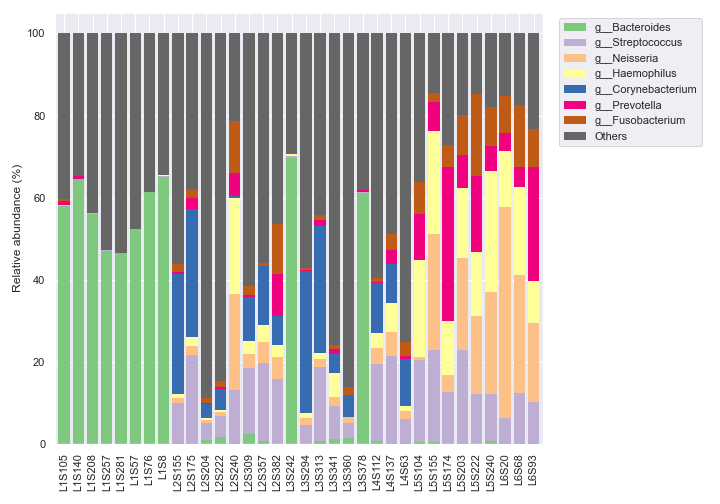
We can sort the samples by the body-site column in metadata with
by=['body-site']. To check whether the sorting worked properly, we can change the x-axis tick labels to include each sample’s body-site withlabel_columns.dokdo.taxa_abundance_bar_plot( qzv_file, by=['body-site'], label_columns=['body-site', 'sample-id'], figsize=(10, 7), level=6, count=8, legend_short=True ) plt.tight_layout()
If you want to sort the samples in a certain order instead of ordering numerically or alphabetically, use the
ordersoption.dokdo.taxa_abundance_bar_plot( qzv_file, by=['body-site'], label_columns=['body-site', 'sample-id'], figsize=(10, 7), level=6, count=8, orders={'body-site': ['left palm', 'tongue', 'gut', 'right palm']}, legend_short=True ) plt.tight_layout()
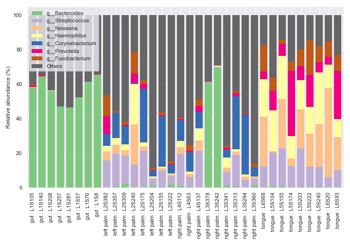
We can only display the ‘gut’ and ‘tongue’ samples with
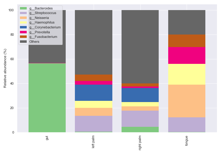
include_samples.fig, [ax1, ax2] = plt.subplots(1, 2, figsize=(9, 7), gridspec_kw={'width_ratios': [9, 1]}) kwargs = dict( include_samples={'body-site': ['gut', 'tongue']}, by=['body-site'], label_columns=['body-site', 'sample-id'], level=6, count=8 ) dokdo.taxa_abundance_bar_plot( qzv_file, ax=ax1, legend=False, **kwargs ) dokdo.taxa_abundance_bar_plot( qzv_file, ax=ax2, legend_short=True, **kwargs ) handles, labels = ax2.get_legend_handles_labels() ax2.clear() ax2.legend(handles, labels) ax2.axis('off') plt.tight_layout()
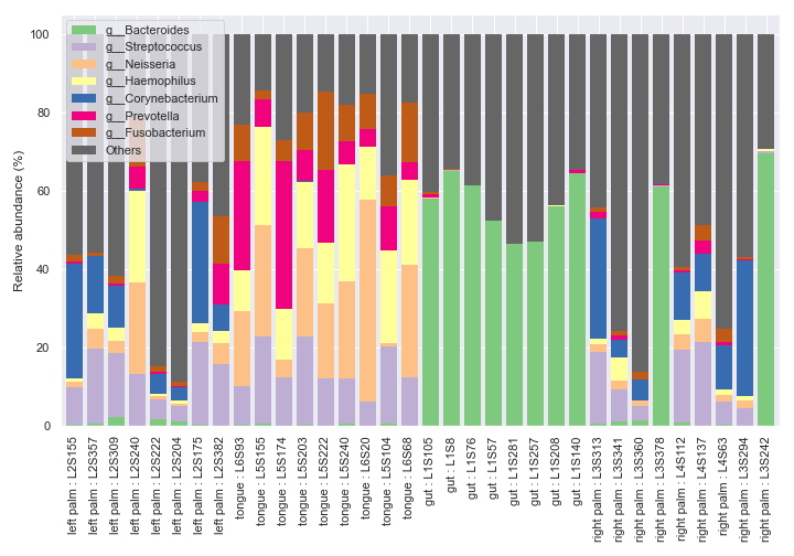
We can make multiple bar charts grouped by body-site. When making a grouped bar chart, it’s important to include
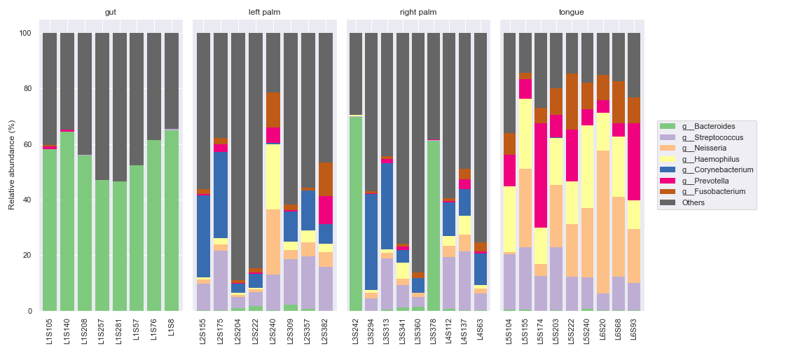
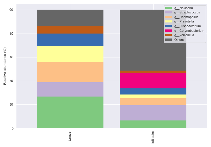
sort_by_mean2=Falsein order to have the same bar colors for the same taxa across different groups.fig, axes = plt.subplots(1, 5, figsize=(16, 7)) groups = ['gut', 'left palm', 'right palm', 'tongue'] kwargs = dict(level=6, count=8, sort_by_mean2=False, legend=False) for i, group in enumerate(groups): dokdo.taxa_abundance_bar_plot( qzv_file, ax=axes[i], include_samples={'body-site': [group]}, **kwargs ) if i != 0: axes[i].set_ylabel('') axes[i].set_yticks([]) axes[i].set_title(group) dokdo.taxa_abundance_bar_plot( qzv_file, ax=axes[4], legend_short=True, **kwargs ) handles, labels = axes[4].get_legend_handles_labels() axes[4].clear() axes[4].legend(handles, labels, loc='center left') axes[4].axis('off') plt.tight_layout()
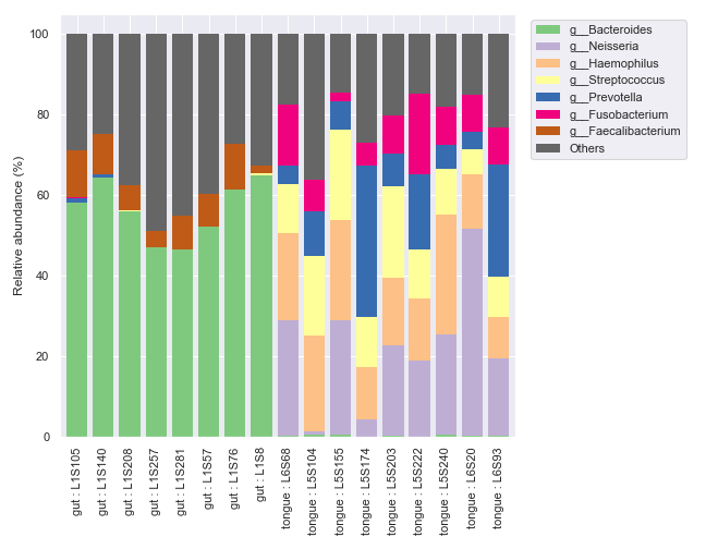
We can select specific samples with
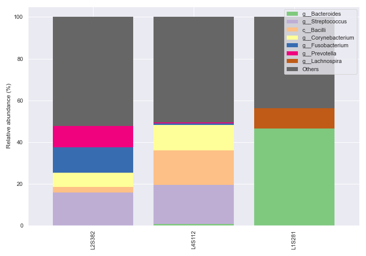
sample_names.dokdo.taxa_abundance_bar_plot( qzv_file, figsize=(10, 7), level=6, count=8, sample_names=['L2S382', 'L4S112', 'L1S281'], legend_short=True ) plt.tight_layout()
We can also pick specific colors for the bars.
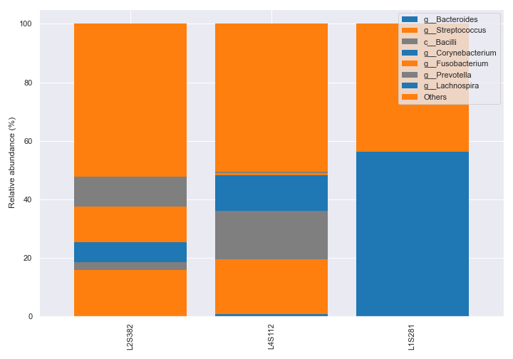
dokdo.taxa_abundance_bar_plot(
    qzv_file,
    figsize=(10, 7),
    level=6,
    count=8,
    sample_names=['L2S382', 'L4S112', 'L1S281'],
    colors=['tab:blue', 'tab:orange', 'tab:gray'],
    legend_short=True
)

plt.tight_layout()
We can create a bar for each sample type.
dokdo.taxa_abundance_bar_plot(
    qzv_file,
    level=6,
    count=8,
    group='body-site',
    figsize=(10, 7),
    legend_short=True
)

plt.tight_layout()
Of course, we can specify which groups to plot on.
dokdo.taxa_abundance_bar_plot(
    qzv_file,
    level=6,
    count=8,
    group='body-site',
    group_order=['tongue', 'left palm'],
    figsize=(10, 7),
    legend_short=True
)

plt.tight_layout()
taxa_abundance_box_plot
- dokdo.api.taxa_abundance.taxa_abundance_box_plot(visualization, metadata=None, hue=None, hue_order=None, level=1, by=None, count=0, exclude_samples=None, include_samples=None, exclude_taxa=None, sort_by_names=False, sample_names=None, csv_file=None, pseudocount=False, taxa_names=None, pretty_taxa=False, show_means=False, meanprops=None, show_others=True, sort_by_mean=True, add_datapoints=False, jitter=1, alpha=None, size=5, palette=None, ax=None, figsize=None)[source]
Create a box plot showing the distribution of relative abundance for individual taxa.
The input visualization may already contain sample metadata. To provide new sample metadata, and ignore the existing one, use the
metadataoption.By default, the method will draw a box for each taxon. To plot grouped box plots, use the
hueoption.q2-taxa plugin
Example
QIIME 2 CLI
qiime taxa barplot [OPTIONS]
QIIME 2 API
from qiime2.plugins.taxa.visualizers import barplot
- Parameters
visualization (str or qiime2.Visualization) – Visualization file or object from the q2-taxa plugin.
metadata (str or qiime2.Metadata, optional) – Metadata file or object.
hue (str, optional) – Grouping variable that will produce boxes with different colors.
hue_order (list, optional) – Specify the order of categorical levels of the ‘hue’ semantic.
level (int, default: 1) – Taxonomic level at which the features should be collapsed.
by (list, optional) – Column name(s) to be used for sorting the samples. Using ‘sample-id’ will sort the samples by their name, in addition to other column name(s) that may have been provided. If multiple items are provided, sorting will occur by the order of the items.
count (int, default: 0) – Number of top taxa to display. When 0, display all.
exclude_samples (dict, optional) – Filtering logic used for sample exclusion. Format: {‘col’: [‘item’, …], …}.
include_samples (dict, optional) – Filtering logic used for sample inclusion. Format: {‘col’: [‘item’, …], …}.
exclude_taxa (list, optional) – The taxa names to be excluded when matched. Case insenstivie.
sort_by_names (bool, default: False) – If true, sort the columns (i.e. species) to be displayed by name.
sample_names (list, optional) – List of sample IDs to be included.
csv_file (str, optional) – Path of the .csv file to output the dataframe to.
pseudocount (bool, default: False) – Add pseudocount to remove zeros.
taxa_names (list, optional) – List of taxa names to be displayed.
pretty_taxa (bool, default: False) – If true, only display the smallest taxa rank in the x-axis labels.
show_means (bool, default: False) – Add means to the boxes.
meanprops (dict, optional) – The meanprops argument as in matplotlib.pyplot.boxplot.
show_others (bool, default: True) – Include the ‘Others’ category.
sort_by_mean (bool, default: True) – Sort taxa by their mean relative abundance after sample filtration.
add_datapoints (bool, default: False) – Show data points on top of the boxes.
jitter (float, default: 1) – Ignored when
add_datapoints=False. Amount of jitter (only along the categorical axis) to apply.alpha (float, optional) – Ignored when
add_datapoints=False. Proportional opacity of the points.size (float, default: 5.0) – Ignored when
add_datapoints=False. Radius of the markers, in points.palette (palette name, list, or dict) – Box colors.
ax (matplotlib.axes.Axes, optional) – Axes object to draw the plot onto, otherwise uses the current Axes.
figsize (tuple, optional) – Width, height in inches. Format: (float, float).
- Returns
Axes object with the plot drawn onto it.
- Return type
matplotlib.axes.Axes
See also
dokdo.api.taxa_abundance_bar_plot,dokdo.api.addpairsExamples
Below is a simple example:
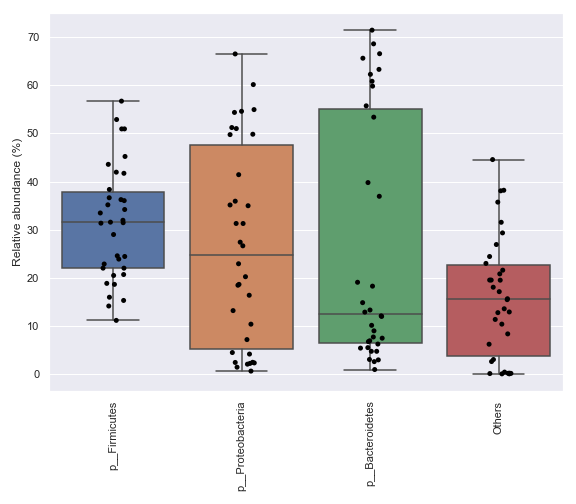
import dokdo
import matplotlib.pyplot as plt
%matplotlib inline
import seaborn as sns
sns.set()

qzv_file = '/Users/sbslee/Desktop/dokdo/data/moving-pictures-tutorial/taxa-bar-plots.qzv'
dokdo.taxa_abundance_box_plot(
    qzv_file,
    level=2,
    figsize=(8, 7)
)
plt.tight_layout()
We can prettify the taxa names:
dokdo.taxa_abundance_box_plot(
    qzv_file,
    level=2,
    pretty_taxa=True,
    figsize=(8, 7)
)
plt.tight_layout()
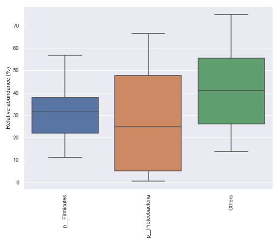
We can only display a selected number of top taxa:
dokdo.taxa_abundance_box_plot(
    qzv_file,
    level=2,
    count=4,
    pretty_taxa=True,
    figsize=(8, 7)
)
plt.tight_layout()
We can add data points on top of the boxes:
dokdo.taxa_abundance_box_plot(
    qzv_file,
    level=2,
    count=4,
    pretty_taxa=True,
    add_datapoints=True,
    figsize=(8, 7)
)
plt.tight_layout()
We can also specify which taxa to plot:
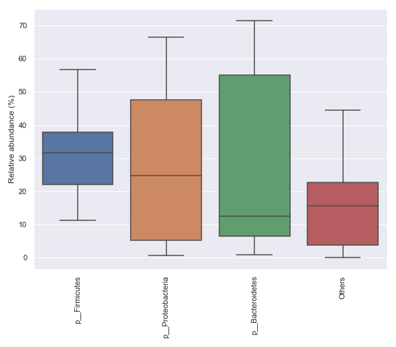
dokdo.taxa_abundance_box_plot(
    qzv_file,
    level=2,
    pretty_taxa=True,
    taxa_names=['k__Bacteria;p__Firmicutes', 'k__Bacteria;p__Proteobacteria'],
    figsize=(8, 7)
)
plt.tight_layout()
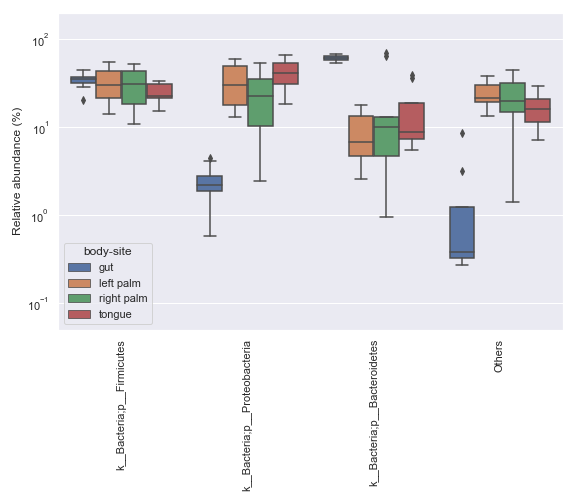
In some cases, it may be desirable to plot abundance in log scale. We can achieve this with:
ax = dokdo.taxa_abundance_box_plot(
    qzv_file,
    level=2,
    hue='body-site',
    count=4,
    pseudocount=True,
    figsize=(8, 7)
)
ax.set_ylim([0.05, 200])
ax.set_yscale('log')
plt.tight_layout()
ancom_volcano_plot
- dokdo.api.ancom_volcano_plot.ancom_volcano_plot(visualization, ax=None, figsize=None, **kwargs)[source]
Create an ANCOM volcano plot.
q2-composition plugin
Example
QIIME 2 CLI
qiime composition ancom [OPTIONS]
QIIME 2 API
from qiime2.plugins.composition.visualizers import ancom
- Parameters
visualization (str or qiime2.Visualization) – Visualization file or object from the q2-composition plugin.
ax (matplotlib.axes.Axes, optional) – Axes object to draw the plot onto, otherwise uses the current Axes.
figsize (tuple, optional) – Width, height in inches. Format: (float, float).
kwargs – Other keyword arguments will be passed down to
seaborn.scatterplot().
- Returns
Axes object with the plot drawn onto it.
- Return type
matplotlib.axes.Axes
Examples
Below is a simple example:
import dokdo
import matplotlib.pyplot as plt
%matplotlib inline
import seaborn as sns
sns.set()
qzv_file = '/Users/sbslee/Desktop/dokdo/data/moving-pictures-tutorial/ancom-subject.qzv'
dokdo.ancom_volcano_plot(qzv_file)
plt.tight_layout()
We can control the size, color, and transparency of data points with the
s,color, andalphaoptions, respectively:dokdo.ancom_volcano_plot(qzv_file, s=80, color='black', alpha=0.5) plt.tight_layout()
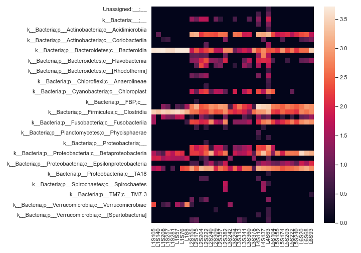
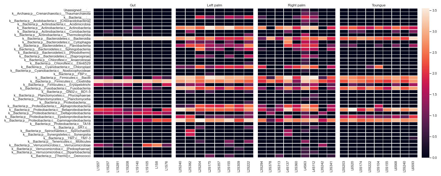
heatmap
- dokdo.api.clustermap.heatmap(artifact, metadata=None, where=None, sort_samples=None, pretty_taxa=False, pname_kws=None, normalize=None, samples=None, taxa=None, flip=False, vmin=None, vmax=None, cbar=True, cbar_kws=None, cbar_ax=None, square=False, label_columns=None, count=0, xticklabels=True, yticklabels=True, ax=None, figsize=None, **kwargs)[source]
Create a heatmap representation of a feature table.
It is strongly recommended to normalize the feature table before generating a heatmap with the
normalizeoption.- Parameters
artifact (str, qiime2.Artifact, pandas.DataFrame) – Artifact file or object with the semantic type
FeatureTable[Frequency]. Alternatively, apandas.DataFrameobject.metadata (str or qiime2.Metadata, optional) – Metadata file or object.
where (str, optional) – SQLite WHERE clause specifying sample metadata criteria that must be met to be included in the filtered feature table.
sort_samples (bool, default: False) – If True, sort the samples by name.
pretty_taxa (bool, default: False) – If True, display only the smallest taxa rank.
pname_kws (dict, optional) – Keyword arguments for
dokdo.api.pname()whenpretty_taxais True.normalize ({None, ‘log10’, ‘clr’, ‘zscore’}, default: None) – Whether to normalize the feature table:
None: Do not normalize.
‘log10’: Apply the log10 transformation after adding a psuedocount of 1.
‘clr’: Apply the centre log ratio (CLR) transformation adding a psuedocount of 1.
‘zscore’: Apply the Z score transformation.
samples, taxa (list, optional) – Specify samples and taxa to be displayed.
flip (bool, default: False) – If True, flip the x and y axes.
vmin, vmax (floats, optional) – Values to anchor the colormap, otherwise they are inferred from the data and other keyword arguments.
cbar (bool, default: True) – Whether to draw a colorbar.
cbar_kws (dict, optional) – Keyword arguments for matplotlib.figure.Figure.colorbar().
cbar_ax (matplotlib.axes.Axes, optional) – Axes in which to draw the colorbar, otherwise take space from the main Axes.
square (bool, default: False) – If True, set the Axes aspect to ‘equal’ so each cell will be square-shaped.
label_columns (list, optional) – List of metadata columns to be concatenated to form new sample labels. Use the string ‘sample-id’ to indicate the sample ID column.
count (int, default: 0) – Number of top taxa to display. When 0, display all.
xticklabels (bool, default: True) – Whether to plot tick labels for the x-axis.
yticklabels (bool, default: True) – Whether to plot tick labels for the y-axis.
ax (matplotlib.axes.Axes, optional) – Axes object to draw the plot onto, otherwise uses the current Axes.
figsize (tuple, optional) – Width, height in inches. Format: (float, float).
- Returns
Axes object with the plot drawn onto it.
- Return type
matplotlib.axes.Axes
See also
Examples
Below is a simple example:
import dokdo
import matplotlib.pyplot as plt
%matplotlib inline
import seaborn as sns
sns.set()
qza_file = '/Users/sbslee/Desktop/dokdo/data/moving-pictures-tutorial/table-l3.qza'
dokdo.heatmap(qza_file,
              normalize='log10',
              flip=True,
              figsize=(10, 7))
plt.tight_layout()
We can display a heatmap for each sample group:
metadata_file = '/Users/sbslee/Desktop/dokdo/data/moving-pictures-tutorial/sample-metadata.tsv'

fig, [ax1, ax2, ax3, ax4, ax5] = plt.subplots(1, 5,
                                              figsize=(20, 8),
                                              gridspec_kw={'width_ratios': [1, 1, 1, 1, 0.1]})

kwargs = dict(normalize='log10',
              flip=True,
              linewidths=0.5,
              metadata=metadata_file,
              xticklabels=True)

qza_file = '/Users/sbslee/Desktop/dokdo/data/moving-pictures-tutorial/table-l3.qza'

dokdo.heatmap(qza_file, ax=ax1, where="[body-site] IN ('gut')", cbar=False, yticklabels=True, **kwargs)
dokdo.heatmap(qza_file, ax=ax2, where="[body-site] IN ('left palm')", yticklabels=False, cbar=False, **kwargs)
dokdo.heatmap(qza_file, ax=ax3, where="[body-site] IN ('right palm')", yticklabels=False, cbar=False, **kwargs)
dokdo.heatmap(qza_file, ax=ax4, where="[body-site] IN ('tongue')", yticklabels=False, cbar_ax=ax5, **kwargs)

ax1.set_title('Gut')
ax2.set_title('Left palm')
ax3.set_title('Right palm')
ax4.set_title('Toungue')

plt.tight_layout()
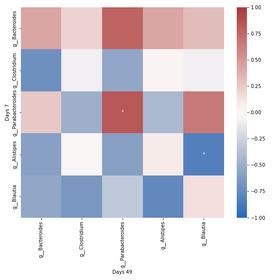
group_correlation_heatmap
- dokdo.api.cross_association.group_correlation_heatmap(artifact, group1_samples, group2_samples, group1_label=None, group2_label=None, taxa_names=None, count=0, sort_by_mean=True, normalize=None, method='spearman', alpha=0.05, csv_file=None, ax=None, figsize=None, **kwargs)[source]
Create a heatmap showing cross-correlation of taxa abundance between two groups.
- Parameters
artifact (str, qiime2.Artifact, or pandas.DataFrame) – Feature table. This can be an QIIME 2 artifact file or object with the semantic type
FeatureTable[Frequency]. If you are importing data from an external tool, you can also provide apandas.DataFrameobject where rows indicate samples and columns indicate taxa.group1_samples, group2_samples (list) – Lists of matched samples from identical subjects (e.g. patient ID).
group1_label, group2_label (str) – Group labels (e.g. before and after treatment).
taxa_names (list, optional) – List of taxa names to be displayed.
count (int, default: 0) – The number of taxa to display. When 0, display all.
sort_by_mean (bool, default: True) – Sort taxa by their mean abundance before filtering with
count. Setsort_by_mean=Falseif the original order of taxa is desired.normalize ({None, ‘log10’, ‘clr’, ‘zscore’}, default: None) – Whether to normalize the the input feature table:
None: Do not normalize.
‘log10’: Apply the log10 transformation adding a psuedocount of 1.
‘clr’: Apply the centre log ratio (CLR) transformation adding a psuedocount of 1.
‘zscore’: Apply the Z score transformation.
method ({‘spearman’, ‘pearson’}, default: ‘spearman’) – Association method.
alpha (float, default: 0.05) – FWER, family-wise error rate.
csv_file (str, optional) – Path of the .csv file to output the dataframe to.
ax (matplotlib.axes.Axes, optional) – Axes object to draw the plot onto, otherwise uses the current Axes.
figsize (tuple, optional) – Width, height in inches. Format: (float, float).
kwargs (other keyword arguments) – Other keyword arguments will be passed down to
seaborn.heatmap().
- Returns
Axes object with the plot drawn onto it.
- Return type
matplotlib.axes.Axes
Examples
qza_file = '/Users/sbslee/Desktop/dokdo/data/parkinsons-mouse-tutorial/dada2_table_l6.qza'

mice_days7 = [
    'recip.413.WT.HC2.D7',  # Mouse ID: 457
    'recip.460.WT.HC3.D7',  # Mouse ID: 468
    'recip.461.ASO.HC3.D7', # Mouse ID: 469
    'recip.463.WT.PD3.D7',  # Mouse ID: 537
    'recip.465.ASO.PD3.D7', # Mouse ID: 538
    'recip.540.ASO.HC4.D7', # Mouse ID: 547
]

mice_days49 = [
    'recip.220.WT.OB1.D7',   # Mouse ID: 457
    'recip.456.ASO.HC3.D49', # Mouse ID: 468
    'recip.458.ASO.HC3.D49', # Mouse ID: 469
    'recip.460.WT.HC3.D49',  # Mouse ID: 537
    'recip.461.ASO.HC3.D49', # Mouse ID: 538
    'recip.536.ASO.PD4.D49', # Mouse ID: 547
]

dokdo.group_correlation_heatmap(
    qza_file, mice_days7, mice_days49, normalize='clr', group1_label='Days 7',
    group2_label='Days 49', cmap='vlag', figsize=(8, 8), count=5)

plt.tight_layout()
Other Plotting Methods
addsig
- dokdo.api.addsig.addsig(x1, x2, y, t='', h=1.0, lw=1.0, lc='black', tc='black', ax=None, figsize=None, fontsize=None)[source]
Add signifiance annotation between two groups in a box plot.
- Parameters
x1 (float) – Position of the first box.
x2 (float) – Position of the second box.
y (float) – Bottom position of the drawing.
t (str, default: ‘’) – Text.
h (float, default: 1.0) – Height of the drawing.
lw (float, default: 1.0) – Line width.
lc (str, default: ‘black’) – Line color.
tc (str, default: ‘black’) – Text color.
ax (matplotlib.axes.Axes, optional) – Axes object to draw the plot onto, otherwise uses the current Axes.
figsize (tuple, optional) – Width, height in inches. Format: (float, float).
fontsize (float, optional) – Sets the fontsize.
- Returns
Axes object with the plot drawn onto it.
- Return type
matplotlib.axes.Axes
Examples
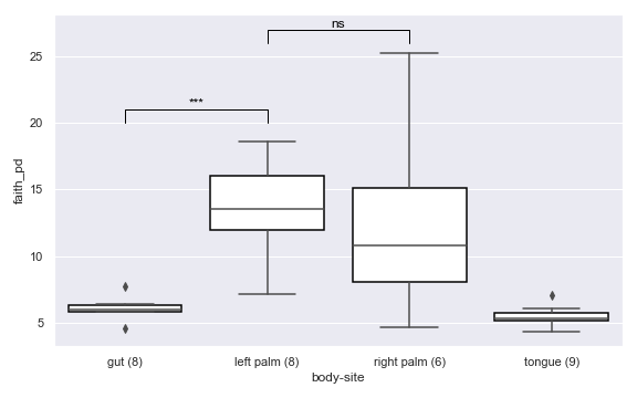
import dokdo
import matplotlib.pyplot as plt
%matplotlib inline
import seaborn as sns
sns.set()
vector_file = '/Users/sbslee/Desktop/dokdo/data/moving-pictures-tutorial/faith_pd_vector.qza'
metadata_file = '/Users/sbslee/Desktop/dokdo/data/moving-pictures-tutorial/sample-metadata.tsv'
ax = dokdo.alpha_diversity_plot(vector_file, metadata_file, 'body-site', figsize=(8, 5))
dokdo.addsig(0, 1, 20, t='***', ax=ax)
dokdo.addsig(1, 2, 26, t='ns', ax=ax)
plt.tight_layout()
addpairs
- dokdo.api.addpairs.addpairs(taxon, csv_file, subject, category, groups, ax=None, figsize=None, width=0.8, **kwargs)[source]
Add paired lines in a plot created by dokdo.taxa_abundance_box_plot.
- Parameters
taxon (str) – Target taxon name.
csv_file (str) – Path to the .csv file from the taxa_abundance_box_plot method.
subject (str) – Column name to indicate pair information.
category (str) – Column name to be studied.
groups (list) – Groups in the category column.
ax (matplotlib.axes.Axes, optional) – Axes object to draw the plot onto, otherwise uses the current Axes.
figsize (tuple, optional) – Width, height in inches. Format: (float, float).
width (float, default: 0.8) – Width of all the elements for one level of the grouping variable.
kwargs (other keyword arguments) – All other keyword arguments are passed to
seaborn.lineplot().
- Returns
Axes object with the plot drawn onto it.
- Return type
matplotlib.axes.Axes
See also
dokdo.api.taxa_abundance_box_plotExamples
Below is a simple example where we pretend we only have the samples shown below and they are from a single subject. We are interested in comparing the relative abundance of the phylum Preteobacteria between the left palm and right palm. We also want to perofrm the comparison in the context of
days-since-experiment-start(i.e. paired comparison).import dokdo from qiime2 import Metadata import matplotlib.pyplot as plt %matplotlib inline import seaborn as sns sns.set() qzv_file = '/Users/sbslee/Desktop/dokdo/data/moving-pictures-tutorial/taxa-bar-plots.qzv' metadata_file = '/Users/sbslee/Desktop/dokdo/data/moving-pictures-tutorial/sample-metadata.tsv' sample_names = ['L2S240', 'L3S242', 'L2S155', 'L4S63', 'L2S175', 'L3S313', 'L2S204', 'L4S112', 'L2S222', 'L4S137'] metadata = Metadata.load(metadata_file) metadata = metadata.filter_ids(sample_names) mf = dokdo.get_mf(metadata) mf = mf[['body-site', 'days-since-experiment-start']] ax = dokdo.taxa_abundance_box_plot( qzv_file, level=2, hue='body-site', taxa_names=['k__Bacteria;p__Proteobacteria'], show_others=False, figsize=(8, 7), sample_names=sample_names, pretty_taxa=True, include_samples={'body-site': ['left palm', 'right palm']}, csv_file='addpairs.csv' ) dokdo.addpairs( 'k__Bacteria;p__Proteobacteria', 'addpairs.csv', 'days-since-experiment-start', 'body-site', ['left palm', 'right palm'], ax=ax ) plt.tight_layout()
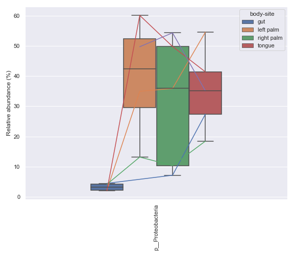
Note that the method suppors more than two groups.
metadata = Metadata.load(metadata_file)
mf = dokdo.get_mf(metadata)
mf = mf[mf['subject'] == 'subject-1']
mf = mf[['body-site', 'days-since-experiment-start']]
mf = mf.drop_duplicates()

ax = dokdo.taxa_abundance_box_plot(
    qzv_file,
    metadata=Metadata(mf),
    level=2,
    hue='body-site',
    taxa_names=['k__Bacteria;p__Proteobacteria'],
    show_others=False,
    figsize=(8, 7),
    pretty_taxa=True,
    csv_file='addpairs.csv'
)

dokdo.addpairs(
    'k__Bacteria;p__Proteobacteria',
    'addpairs.csv',
    'days-since-experiment-start',
    'body-site',
    ['gut', 'left palm', 'right palm', 'tongue'],
    ax=ax
)

plt.tight_layout()
addbiplot
- dokdo.api.addbiplot.addbiplot(pcoa_results, dim=2, scale=1.0, count=5, fontsize=None, name_type='feature', taxonomy=None, level=None, ax=None, figsize=None)[source]
Draw arrows (features) to an existing PCoA plot.
This method supports both 2D and 3D plots.
- Parameters
pcoa_results (str or qiime2.Artifact) – Artifact file or object corresponding to PCoAResults % Properties(‘biplot’).
dim ([2, 3], default: 2) – Dimension of the plot.
scale (float, default: 1.0) – Scale for arrow length.
count (int, default: 5) – Number of important features to be displayed.
fontsize (float or str, optional) – Sets font size.
name_type ([‘feature’, ‘taxon’, ‘confidence’], default: ‘feature’) – Determines the type of names displayed. Using ‘taxon’ and ‘confidence’ requires taxonomy.
taxonomy (str or qiime2.Artifact) – Artifact file or object corresponding to FeatureData[Taxonomy]. Required if
name_typeis ‘taxon’ or ‘confidence’.level (int, optional) – Level of taxonomic rank to be displayed. This argument has an effect only when
name_typeis ‘taxon’.ax (matplotlib.axes.Axes, optional) – Axes object to draw the plot onto, otherwise uses the current Axes.
figsize (tuple, optional) – Width, height in inches. Format: (float, float).
- Returns
Axes object with the plot drawn onto it.
- Return type
matplotlib.axes.Axes
Examples
Below is a simple example.
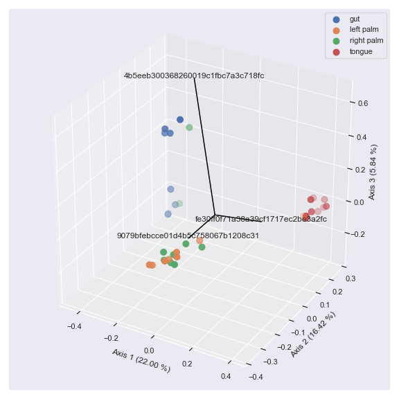
import dokdo
import matplotlib.pyplot as plt
%matplotlib inline
import seaborn as sns
sns.set()

table_file = '/Users/sbslee/Desktop/dokdo/data/moving-pictures-tutorial/table.qza'
metadata_file = '/Users/sbslee/Desktop/dokdo/data/moving-pictures-tutorial/sample-metadata.tsv'
pcoa_results = dokdo.ordinate(table_file, sampling_depth=0, biplot=True, number_of_dimensions=10)
ax = dokdo.beta_2d_plot(pcoa_results,
                        hue='body-site',
                        metadata=metadata_file,
                        figsize=(8, 8))
dokdo.addbiplot(pcoa_results, ax=ax, count=3)
plt.tight_layout()
We can also draw a 3D biplot.
ax = dokdo.beta_3d_plot(pcoa_results,
                        hue='body-site',
                        metadata=metadata_file,
                        figsize=(8, 8))
dokdo.addbiplot(pcoa_results, ax=ax, count=3, dim=3)
plt.tight_layout()
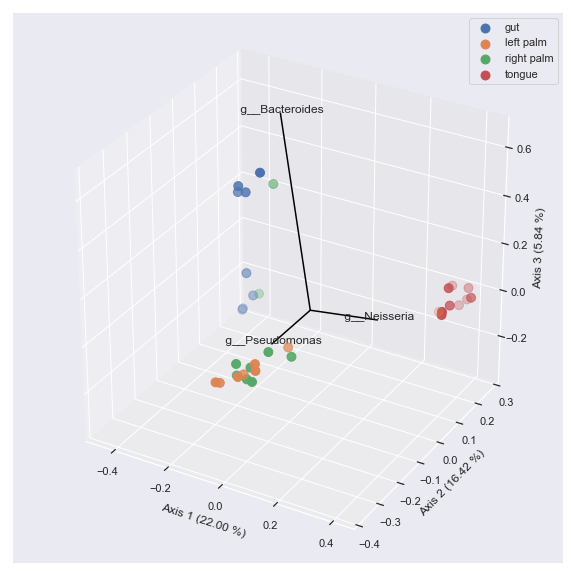
Finally, we can display taxonomic classification instead of feature ID.
taxonomy_file = '/Users/sbslee/Desktop/dokdo/data/moving-pictures-tutorial/taxonomy.qza'
ax = dokdo.beta_3d_plot(pcoa_results,
                        hue='body-site',
                        metadata=metadata_file,
                        figsize=(8, 8))
dokdo.addbiplot(pcoa_results,
                ax=ax,
                count=3,
                dim=3,
                taxonomy=taxonomy_file,
                name_type='taxon',
                level=6)
plt.tight_layout()
clustermap
- dokdo.api.clustermap.clustermap(artifact, metadata=None, flip=False, hue1=None, hue_order1=None, hue1_cmap='tab10', hue1_loc='upper right', hue2=None, hue_order2=None, hue2_cmap='Pastel1', hue2_loc='upper left', normalize=None, method='average', metric='euclidean', figsize=(10, 10), row_cluster=True, col_cluster=True, **kwargs)[source]
Create a hierarchically clustered heatmap of a feature table.
- Parameters
artifact (str, qiime2.Artifact, pandas.DataFrame) – Artifact file or object with the semantic type
FeatureTable[Frequency]. Alternatively, apandas.DataFrameobject.metadata (str or qiime2.Metadata, optional) – Metadata file or object.
flip (bool, default: False) – If True, flip the x and y axes.
hue1 (str, optional) – First grouping variable that will produce labels with different colors.
hue_order1 (list, optional) – Specify the order of categorical levels of the ‘hue1’ semantic.
hue1_cmap (str, default: ‘tab10’) – Name of the colormap passed to
matplotlib.cm.get_cmap()for hue1.hue1_loc (str, default: ‘upper right’) – Location of the legend for hue1.
hue2 (str, optional) – Second grouping variable that will produce labels with different colors.
hue_order2 (list, optional) – Specify the order of categorical levels of the ‘hue2’ semantic.
hue2_cmap (str, default: ‘Pastel1’) – Name of the colormap passed to
matplotlib.cm.get_cmap()for hue2.hue2_loc (str, default: ‘upper left’) – Location of the legend for hue2.
normalize ({None, ‘log10’, ‘clr’, ‘zscore’}, default: None) – Whether to normalize the the input feature table:
None: Do not normalize.
‘log10’: Apply the log10 transformation adding a psuedocount of 1.
‘clr’: Apply the centre log ratio (CLR) transformation adding a psuedocount of 1.
‘zscore’: Apply the Z score transformation.
method (str, default: ‘average’) – Linkage method to use for calculating clusters. See
scipy.cluster.hierarchy.linkage()for more details.metric (str, default: ‘euclidean’) – Distance metric to use for the data. See scipy.spatial.distance.pdist() documentation for more options.
figsize (tuple, default: (10, 10)) – Width, height in inches. Format: (float, float).
row_cluster (bool, default: True) – If True, cluster the rows.
col_cluster (bool, default: True) – If True, cluster the columns.
kwargs (other keyword arguments) – Other keyword arguments will be passed down to
seaborn.clustermap().
- Returns
A ClusterGrid instance.
- Return type
seaborn.matrix.ClusterGrid
See also
Examples
Below is a simple example:
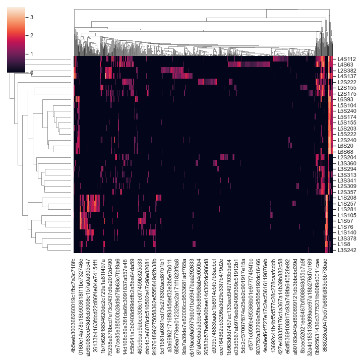
import dokdo
import matplotlib.pyplot as plt
%matplotlib inline
import seaborn as sns
sns.set()
qza_file = '/Users/sbslee/Desktop/dokdo/data/moving-pictures-tutorial/table.qza'
dokdo.clustermap(qza_file,
                 normalize='log10')
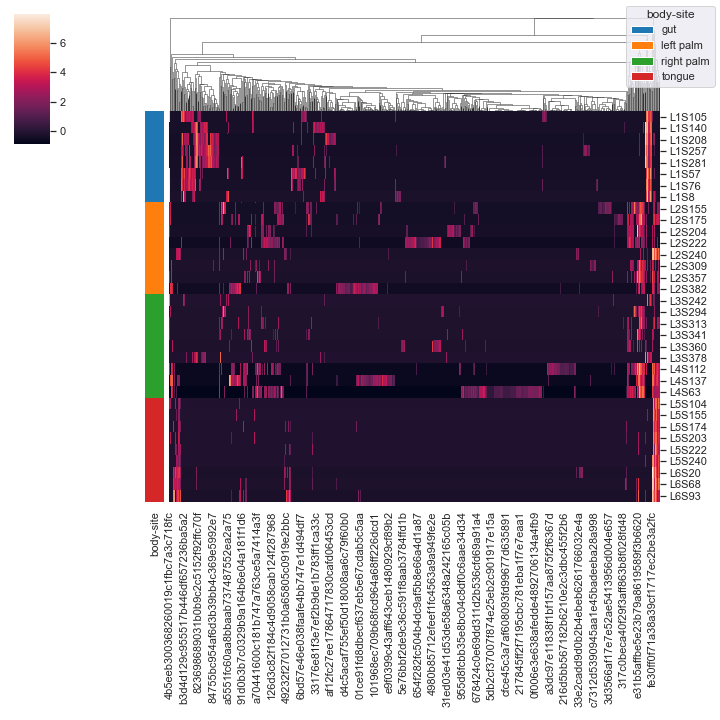
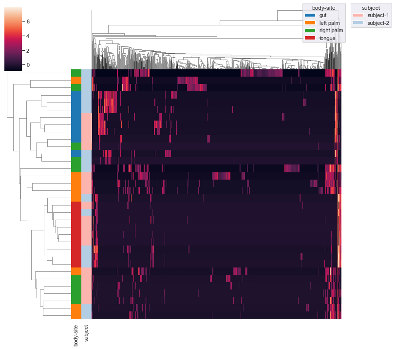
We can color the samples by
body-siteand use the centered log-ratio transformation (CLR) for normalziation:metadata_file = '/Users/sbslee/Desktop/dokdo/data/moving-pictures-tutorial/sample-metadata.tsv' dokdo.clustermap(qza_file, metadata=metadata_file, normalize='clr', hue1='body-site')

We can omit the clustering of samples:
dokdo.clustermap(qza_file,
                 metadata=metadata_file,
                 normalize='clr',
                 hue1='body-site',
                 row_cluster=False)
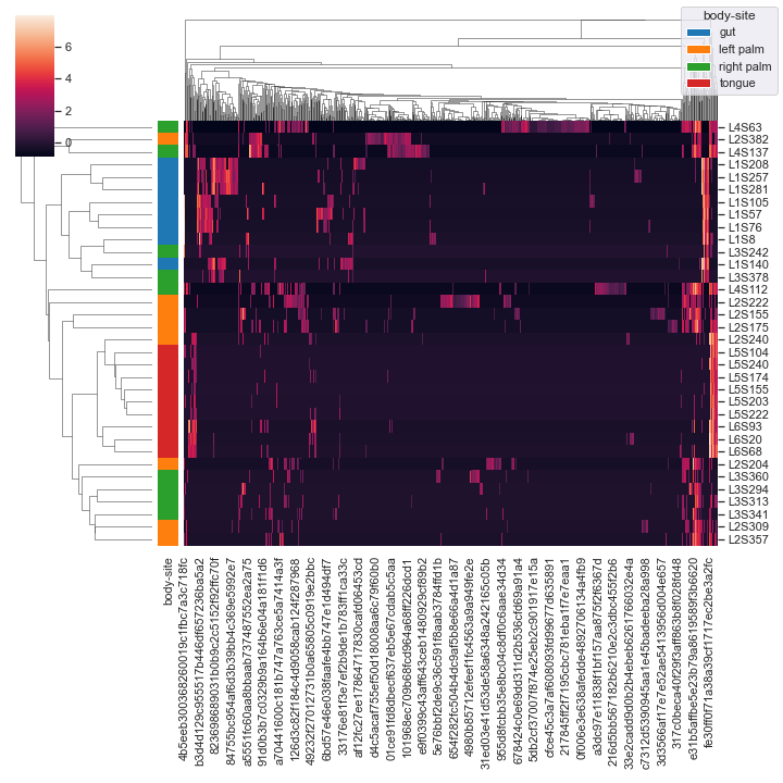
We can add an additional grouping variable
subject. This may require you to usebbox_inches='tight'option in theplt.savefig()method when saving the figure as a file (e.g. PNG) because otherwise there could be weird issues with the legends (because there are now two legends instead of just one). Additionally, note thatxticklabelsandyticklabelsare extra keyword arguments that are passed toseaborn.clustermap().dokdo.clustermap(qza_file, metadata=metadata_file, normalize='clr', hue1='body-site', hue2='subject', xticklabels=False, yticklabels=False) plt.savefig('out.png', bbox_inches='tight')
Finally, we can provide
pandas.DataFrameas input:import pandas as pd csv_file = '/Users/sbslee/Desktop/dokdo/data/moving-pictures-tutorial/table.csv' df = pd.read_csv(csv_file, index_col=0) dokdo.clustermap(df, metadata=metadata_file, normalize='clr', hue1='body-site')
cross_association_heatmap
- dokdo.api.cross_association.cross_association_heatmap(artifact, target, method='spearman', normalize=None, alpha=0.05, multitest='fdr_bh', nsig=0, marksig=False, figsize=None, cmap=None, **kwargs)[source]
Create a heatmap showing cross-correlatation between feature table and target matrices.
- Parameters
artifact (str, qiime2.Artifact, or pandas.DataFrame) – Feature table. This can be an QIIME 2 artifact file or object with the semantic type
FeatureTable[Frequency]. If you are importing data from an external tool, you can also provide apandas.DataFrameobject where rows indicate samples and columns indicate taxa.target (pandas.DataFrame) – Target
pandas.DataFrameobject to be used for cross-correlation analysis.method ({‘spearman’, ‘pearson’}, default: ‘spearman’) – Association method.
normalize ({None, ‘log10’, ‘clr’, ‘zscore’}, default: None) – Whether to normalize the feature table:
None: Do not normalize.
‘log10’: Apply the log10 transformation after adding a psuedocount of 1.
‘clr’: Apply the centre log ratio (CLR) transformation adding a psuedocount of 1.
‘zscore’: Apply the Z score transformation.
alpha (float, default: 0.05) – FWER, family-wise error rate.
multitest (str, default: ‘fdr_bh’) – Method used for testing and adjustment of p values, as defined in
statsmodels.stats.multitest.multipletests().nsig (int, default: 0) – Mininum number of significant correlations for each element.
marksig (bool, default: False) – If True, mark statistically significant associations with asterisk.
figsize (tuple, optional) – Width, height in inches. Format: (float, float).
cmap (str, optional) – Name of the colormap passed to
matplotlib.cm.get_cmap().kwargs (other keyword arguments) – All other keyword arguments are passed to
seaborn.clustermap().
- Returns
A ClusterGrid instance.
- Return type
seaborn.matrix.ClusterGrid
See also
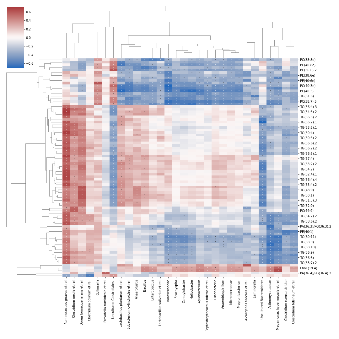
dokdo.api.cross_association.cross_association_table,dokdo.api.cross_association.cross_association_regplotExamples
Below example is taken from a tutorial by Leo Lahti and Sudarshan Shetty et al.
import dokdo
import matplotlib.pyplot as plt
%matplotlib inline
import pandas as pd

otu = pd.read_csv('/Users/sbslee/Desktop/dokdo/data/miscellaneous/otu.csv', index_col=0)
lipids = pd.read_csv('/Users/sbslee/Desktop/dokdo/data/miscellaneous/lipids.csv', index_col=0)
dokdo.cross_association_heatmap(
   otu, lipids, normalize='log10', nsig=1,
   figsize=(15, 15), cmap='vlag', marksig=True,
   annot_kws={'fontsize': 6, 'ha': 'center', 'va': 'center'}
)
cross_association_regplot
- dokdo.api.cross_association.cross_association_regplot(artifact, target, taxon, name, ax=None, figsize=None)[source]
Create a scatter plot showing the cross-correlatation of a specific pair between feature table and target matrices.
- Parameters
artifact (str, qiime2.Artifact, or pandas.DataFrame) – Feature table. This can be an QIIME 2 artifact file or object with the semantic type
FeatureTable[Frequency]. If you are importing data from an external tool, you can also provide apandas.DataFrameobject where rows indicate samples and columns indicate taxa.target (pandas.DataFrame) – Target
pandas.DataFrameobject to be used for cross-correlation analysis.taxon (str) – Taxon in feature table.
name (str) – Target name.
ax (matplotlib.axes.Axes, optional) – Axes object to draw the plot onto, otherwise uses the current Axes.
figsize (tuple, optional) – Width, height in inches. Format: (float, float).
- Returns
Axes object with the plot drawn onto it.
- Return type
matplotlib.axes.Axes
See also
dokdo.api.cross_association.cross_association_table,dokdo.api.cross_association.cross_association_heatmapExamples
import dokdo
import matplotlib.pyplot as plt
%matplotlib inline
import pandas as pd

otu = pd.read_csv('/Users/sbslee/Desktop/dokdo/data/miscellaneous/otu.csv', index_col=0)
lipids = pd.read_csv('/Users/sbslee/Desktop/dokdo/data/miscellaneous/lipids.csv', index_col=0)
dokdo.cross_association_regplot(otu, lipids, 'Ruminococcus gnavus et rel.', 'TG(54:5).2')
plt.tight_layout()
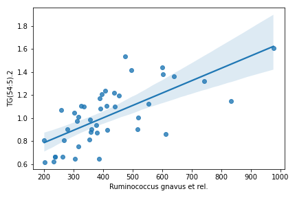
regplot
- dokdo.api.regplot.regplot(taxon, csv_file, subject, category, group1, group2, label=None, ax=None, figsize=None)[source]
Plot relative abundance data and a linear regression model fit from paired samples for the given taxon.
- Parameters
taxon (str) – Target taxon name.
csv_file (str) – Path to the .csv file from the taxa_abundance_box_plot method.
subject (str) – Column name to indicate pair information.
category (str) – Column name to be studied.
group1 (str) – First group in the category column.
group2 (str) – Second group in the category column.
label (str) – Label to use for the legend.
ax (matplotlib.axes.Axes, optional) – Axes object to draw the plot onto, otherwise uses the current Axes.
figsize (tuple, optional) – Width, height in inches. Format: (float, float).
- Returns
Axes object with the plot drawn onto it.
- Return type
matplotlib.axes.Axes
See also
dokdo.api.taxa_abundance_box_plotExamples
Below is a simple example where we pretend we only have the samples shown below and they are from a single subject. We are interested in comparing the relative abundance of the phylum Preteobacteria between the left palm and right palm. We also want to perofrm the comparison in the context of
days-since-experiment-start(i.e. paired comparison).import dokdo from qiime2 import Metadata import matplotlib.pyplot as plt %matplotlib inline import seaborn as sns sns.set() sample_names = ['L2S240', 'L3S242', 'L2S155', 'L4S63', 'L2S175', 'L3S313', 'L2S204', 'L4S112', 'L2S222', 'L4S137'] qzv_file = '/Users/sbslee/Desktop/dokdo/data/moving-pictures-tutorial/taxa-bar-plots.qzv' metadata_file = '/Users/sbslee/Desktop/dokdo/data/moving-pictures-tutorial/sample-metadata.tsv' metadata = Metadata.load(metadata_file) metadata = metadata.filter_ids(sample_names) mf = dokdo.get_mf(metadata) mf = mf[['body-site', 'days-since-experiment-start']] dokdo.taxa_abundance_box_plot( qzv_file, level=2, hue='body-site', taxa_names=['k__Bacteria;p__Proteobacteria'], show_others=False, figsize=(8, 7), sample_names=sample_names, pretty_taxa=True, include_samples={'body-site': ['left palm', 'right palm']}, csv_file='addpairs.csv' ) plt.tight_layout()
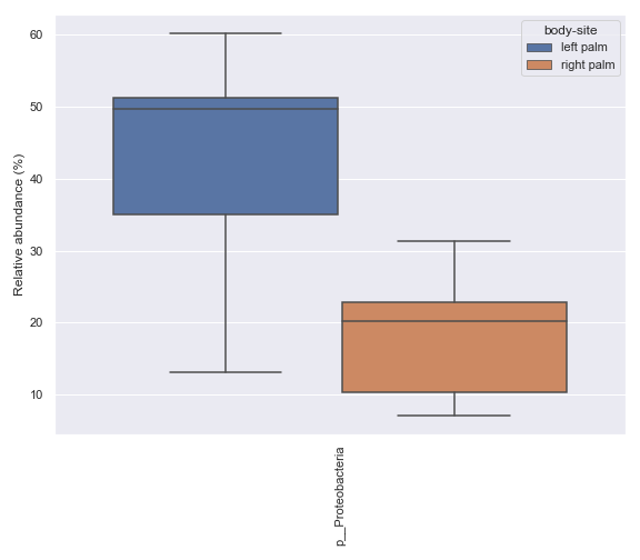
Finally, run the
dokdo.regplotmethod.dokdo.regplot('k__Bacteria;p__Proteobacteria', 'addpairs.csv', 'days-since-experiment-start', 'body-site', 'left palm', 'right palm', figsize=(8, 7)) plt.tight_layout()